# islandcn documentation
> islandcn is the open-source Dynamic Island for React, installed with shadcn. It shows uploads, timers, calls, rides and music in one animated pill at the top of any web app, and you shape each activity around your app's own actions.
# Overview
islandcn is the open-source Dynamic Island for React. It shows what your app is doing in one black pill at the top of the page.
> For the full documentation index, see [llms.txt](https://islandcn.dev/llms.txt). Every page has a Markdown version: add `.md` to its URL or send `Accept: text/markdown`. To build an island, follow the islandcn agent skill at https://islandcn.dev/.well-known/agent-skills/islandcn/SKILL.md.
Use islandcn when your app has work the user waits on, such as an upload, a timer, a call or a delivery, and you want its status in one place that grows when it needs attention and gets out of the way when it doesn't.
## What you install
islandcn ships through the shadcn CLI, so the code lands in your project and you own it.
**[The engine](/docs/api/island-provider)**
`island-core`, written to `lib/island/`. A provider that holds a stack of activities, the pill that draws them, and the springs that move between shapes. It depends on React and nothing else.
**[Presets](/docs/presets)**
Ten ready islands in `components/islandcn/`, one file each, plus the small content kit they share: text styles, glyphs, rings, bars and buttons.
## How it behaves
An activity is one task. You start it with what it shows in each shape, update it as the task moves, and end it when the task is done. The island picks the shape:
- **Idle:** nothing runs. A small black capsule.
- **Compact:** one activity. A glyph on the left of the camera area, a value on the right.
- **Split:** two activities. The main one keeps the pill and the second moves into a round capsule beside it.
- **Expanded:** a long-press or an alert. A wide card with a title, details and controls.
```tsx components/upload-button.tsx
"use client";
import { Glyph } from "@/components/islandcn/glyph";
import { UploadGlyph } from "@/components/islandcn/glyphs";
import { ExpandedBottom } from "@/components/islandcn/island-layout";
import { ExpandedTitle } from "@/components/islandcn/island-text";
import { LinearProgress } from "@/components/islandcn/linear-progress";
import { ProgressRing } from "@/components/islandcn/progress-ring";
import { useIsland } from "@/lib/island";
// Your upload: it sends the file and reports progress from 0 to 1.
import { sendFile } from "./send-file";
/** How long the "Uploaded" alert gets before the activity ends: the alert's own hold, about 6 s, and a beat. */
const DONE_MS = 7000;
export const UploadButton = ({ file }: { file: File }) => {
const island = useIsland();
const upload = async () => {
// One id per upload, so a second upload can't be ended by the first one's timer below.
const activity = island.start({
id: `upload-${crypto.randomUUID()}`,
label: `Uploading ${file.name}`,
compact: { leading: , trailing: },
expanded: {
center: {file.name},
bottom: (
),
},
});
// As the upload moves on, the ring and the bar follow it.
await sendFile(file, (value: number) => {
activity.update({
compact: { trailing: },
expanded: {
bottom: (
),
},
});
});
// When it lands, open the island to say so. The alert closes by itself; end the activity after it.
activity.update({ alert: true, expanded: { center: Uploaded } });
window.setTimeout(() => activity.end(), DONE_MS);
};
return ;
};
```
## What it is not
- It is not a notification system. Use it for tasks with a beginning and an end.
- It draws no platform assets. The look is drawn from scratch, the glyphs are islandcn's own, and text uses the system font stack.
- Sizes are CSS pixels tuned to a 402 px wide phone screen. On a wider screen the island keeps the same size, so it never stretches across a desktop window.
## Next steps
**[Installation](/docs/installation)**
Add the engine to a shadcn project and mount the island once.
**[Quick start](/docs/quick-start)**
Start, update and end your first activity in about five minutes.
---
# Installation
Add the islandcn engine to a React project with the shadcn CLI and mount the island once.
> For the full documentation index, see [llms.txt](https://islandcn.dev/llms.txt). Every page has a Markdown version: add `.md` to its URL or send `Accept: text/markdown`. To build an island, follow the islandcn agent skill at https://islandcn.dev/.well-known/agent-skills/islandcn/SKILL.md.
By the end of this page your app renders a black pill at the top centre of the window, ready for activities.
You need React 19 and a project set up for shadcn (a `components.json` at the root). If you don't have one, run `npx shadcn@latest init` first.
1. **Install the engine**
```package-install
npx shadcn@latest add https://islandcn.dev/r/island-core.json
```
This writes the engine to `lib/island/`, under your `lib` alias. It adds no npm packages.
2. **Mount the provider and the island**
Render `IslandProvider` once, high in the tree, and `Island` once inside it. `placement="viewport"` pins the pill to the top centre of the window. Without it, the pill draws at the top of its nearest positioned parent, which is what you want inside a phone mockup.
**Next.js**
`IslandProvider` holds state, so it renders on the client. Put it in a client file and use that file from the root layout.
```tsx app/providers.tsx
"use client";
import type { ReactNode } from "react";
import { Island, IslandProvider } from "@/lib/island";
export const Providers = ({ children }: { children: ReactNode }) => (
{children}
);
```
```tsx app/layout.tsx
import type { ReactNode } from "react";
import { Providers } from "./providers";
const RootLayout = ({ children }: { children: ReactNode }) => (
{children}
);
export default RootLayout;
```
**Vite**
Wrap the root once in `main.tsx`. The shadcn CLI needs the `@` path alias in `tsconfig.json` and `vite.config.ts`; `npx shadcn@latest init` tells you if it is missing.
```tsx src/main.tsx
import { StrictMode } from "react";
import { createRoot } from "react-dom/client";
import { Island, IslandProvider } from "@/lib/island";
import { App } from "./app";
const root = document.getElementById("root");
if (root) {
createRoot(root).render(
,
);
}
```
3. **Check it**
Reload the page. A black pill sits at the top centre. It does nothing yet: it waits for an activity.
## Add a preset
Each preset is its own registry item and names it on its page. The first one you add also installs `island-content`, the kit the presets share. For example, the timer:
```package-install
npx shadcn@latest add https://islandcn.dev/r/timer-activity.json
```
:::tip
Coding agent? Install the [islandcn agent skill](/docs/agent-skill) and it will wire an activity to your app's state for you.
:::
## Done when
- `lib/island/index.ts` exists.
- The page shows a black pill at the top centre when no activity runs.
- Starting an activity grows the pill, and ending it returns the pill to rest. The [quick start](/docs/quick-start) does exactly that.
---
# Quick start
Start an activity from a button, update it while the task runs, and end it when the task is done.
> For the full documentation index, see [llms.txt](https://islandcn.dev/llms.txt). Every page has a Markdown version: add `.md` to its URL or send `Accept: text/markdown`. To build an island, follow the islandcn agent skill at https://islandcn.dev/.well-known/agent-skills/islandcn/SKILL.md.
You will build an upload button whose progress shows in the island. It takes about five minutes. You need the engine mounted first, see [Installation](/docs/installation).
1. **Install the content kit**
The engine draws any React node. The content kit gives you text and glyphs sized to the pill, so the island looks right without tuning.
```package-install
npx shadcn@latest add https://islandcn.dev/r/island-content.json
```
2. **Start an activity**
`useIsland()` works in any component under the provider. `start` takes an `id`, a `label` for screen readers, and what to draw in each shape. It returns a handle.
```tsx components/upload-button.tsx
"use client";
import { Glyph } from "@/components/islandcn/glyph";
import { UploadGlyph } from "@/components/islandcn/glyphs";
import { CompactText, ExpandedTitle } from "@/components/islandcn/island-text";
import { useIsland } from "@/lib/island";
export const UploadButton = () => {
const island = useIsland();
const upload = () => {
const activity = island.start({
id: "upload",
label: "Uploading photos.zip",
compact: { leading: , trailing: 0% },
expanded: { center: photos.zip },
});
let percent = 0;
const timer = window.setInterval(() => {
percent += 10;
activity.update({ compact: { trailing: {`${percent}%`} } });
if (percent >= 100) {
window.clearInterval(timer);
activity.end();
}
}, 400);
};
return ;
};
```
3. **Try it**
Render `` and press it. The pill grows into the compact shape, the percentage counts up, and the pill folds back to rest at 100%. Hold the pill to see the expanded view.
## What just happened
- `start` added the activity, so the island moved from idle to compact.
- `update` changed only the trailing slot. Nested content merges, so the leading glyph stayed.
- `end` removed it, and with nothing else running the island returned to idle.
## Next steps
**[Activities](/docs/guides/activities)**
The life of an activity, groups, and numbers that animate.
**[Presets](/docs/presets)**
Nine finished islands to install or read for technique.
---
# Activities
Start an activity when a task begins, update it as the task moves, and end it when the task is done.
> For the full documentation index, see [llms.txt](https://islandcn.dev/llms.txt). Every page has a Markdown version: add `.md` to its URL or send `Accept: text/markdown`. To build an island, follow the islandcn agent skill at https://islandcn.dev/.well-known/agent-skills/islandcn/SKILL.md.
Read this when you are wiring the island to one of your app's own tasks. An activity is one task the user is waiting on: a run, an upload, a call. You describe what it shows in each shape and hand it to `start`.
```tsx
"use client";
import { Glyph } from "@/components/islandcn/glyph";
import { TimerGlyph } from "@/components/islandcn/glyphs";
import { CompactText, ExpandedTitle } from "@/components/islandcn/island-text";
import { ProgressRing } from "@/components/islandcn/progress-ring";
import { useIsland } from "@/lib/island";
export const useTeaTimer = (openTimerScreen: () => void) => {
const island = useIsland();
return () =>
island.start({
id: "timer",
compact: { leading: , trailing: 5:00 },
minimal: ,
expanded: {
leading: ,
center: Tea,
},
onPress: openTimerScreen,
});
};
```
## The shape
| Field | What it is |
| --- | --- |
| `id` | A stable name for the activity. `island.expand(id)` uses it, and starting the same id again updates it |
| `label` | What screen readers say, and the pill button's name. Defaults to the id |
| `priority` | Who keeps the pill when two activities run. Higher wins, then the first started |
| `group` | Activities with the same group show one at a time, see [Groups](/docs/guides/activities#groups) |
| `compact` | `{ leading, trailing }` for when it runs alone |
| `minimal` | The fallback for the split when the compact pair is too wide for it. Falls back to `compact.leading` |
| `expanded` | `{ leading, trailing, center, bottom }` for a long-press or an alert |
| `alert` | `true` to open the expanded view briefly, see [Alerts](/docs/guides/actions#alerts) |
| `onPress` | Called when the user taps the pill while this activity shows |
The full types are in the [activity reference](/docs/api/activity-options).
## The life of an activity
1. `island.start(activity)` adds it and returns a [handle](/docs/api/use-island#activityhandle). The pill grows from idle to compact.
2. `handle.update(changes)` changes what it shows. Pass only what changed; the regions you leave out keep their content. Updates apply in place; add `transition: "crossfade"` when the content is different rather than newer (see [Numbers and progress](/docs/guides/activities#numbers-and-progress)).
3. `handle.end()` removes it. With nothing else running, the pill folds back to idle.
Content is React, so it re-renders like the rest of your app. For values that change many times a second, such as a progress ring, render a component that reads your own state instead of calling `update` on every tick. A component that only starts and updates activities can use `useIslandActions()`, which never re-renders it when the island changes.
## As a component
Most presets wrap this in a component with the content kit's `useActivity`, which starts the activity on mount, updates it when its inputs change and ends it on unmount:
```tsx
"use client";
import { Glyph } from "@/components/islandcn/glyph";
import { TimerGlyph } from "@/components/islandcn/glyphs";
import { CompactText } from "@/components/islandcn/island-text";
import { TickingTime } from "@/components/islandcn/ticking-time";
import { useActivity } from "@/components/islandcn/use-activity";
export const TimerIsland = ({ endsAt }: { endsAt: number }) => {
useActivity(
() => ({
id: "timer",
label: "Tea timer",
compact: {
leading: ,
trailing: (
),
},
}),
[endsAt],
);
return null;
};
```
Render `` while the timer runs and remove it when it stops.
## Numbers and progress
A live status activity changes in two ways. A newer value of the same thing, such as a percentage going up, changes in place: the digits turn over and the bar moves. Content that is different rather than newer, such as a new track or the next step of a run, crossfades. The engine does both.
### In place
`update` keeps the same content layer, so React updates it like any other component. Two engine primitives animate the change on the island's clock:
```tsx
import { IslandNumber, IslandProgress } from "@/lib/island";
export const Charging = ({ level }: { level: number }) => (
<>
);
```
- `IslandNumber` lines the old and new text up from the right and turns over only the characters that changed. The old character shrinks and blurs while it stays bright, then fades out by 0.26 s; the new one appears at 0.2 s, small and soft, and grows and sharpens until about 0.48 s. Digits that stay the same don't move, and going from 9 to 10 turns over both places. `numberMotion` holds the timing.
- `IslandProgress` springs its fill to the new value (response 0.97, dampingFraction 0.74 by default, fitted on the simulator's bar).
With reduced motion, the number changes with a plain fade and the bar eases over 0.2 s with no overshoot. Their props are in the [primitives reference](/docs/api/primitives).
The presets use them through the content kit: `NumberText` wraps `IslandNumber`, `TickingTime` renders a clock through it, and `LinearProgress` wraps `IslandProgress`. The upload, battery, transfer, timer, recording, call, ETA and now playing presets turn their digits over this way; upload and now playing move their bars with `IslandProgress`.
### A crossfade
Pass `transition: "crossfade"` to replace the content layer with the transition's blur and fade instead:
```tsx
import { CompactText } from "@/components/islandcn/island-text";
import type { ActivityHandle } from "@/lib/island";
export const startProcessing = (upload: ActivityHandle) =>
upload.update({ transition: "crossfade", compact: { trailing: Processing } });
```
### With an alert
An alerting update (`alert: true`) expands with the content the activity already had, then applies the update in place 0.12 s later (`motion.alertContentDelay`), as the reference phone does: the island opens, then the number turns over and the bar moves. See [Alerts](/docs/guides/actions#alerts).
## Groups
On the reference phone, one app's live status activities don't split the island between them. One shows, and the others wait. Give activities the same `group` to get that behaviour:
```tsx
"use client";
import { CompactText } from "@/components/islandcn/island-text";
import { useIslandActions } from "@/lib/island";
export const useOrders = () => {
const island = useIslandActions();
return () => {
island.start({ id: "order-1042", group: "orders", label: "Order 1042", compact: { trailing: 12 min } });
island.start({ id: "order-1043", group: "orders", label: "Order 1043", compact: { trailing: 25 min } });
// The island shows order 1042 only. Order 1043 waits hidden.
};
};
```
Without `group`, every activity shows and two of them split the island, as before.
### Which one shows
The first started shows. The others are hidden, but `island.activities` still lists them, so your UI can show them elsewhere.
### Handing over
An alert on a hidden activity hands the island over to it, measured on the simulator:
1. The shown activity leaves to idle with the dismiss motion.
2. The island stays idle for 1.458 s (`motion.group.handoff`).
3. The alerting activity expands from idle, already showing its update.
4. It returns to compact 6.014 s after the first one left (`motion.group.window`), so the expanded view stays up for about 4.56 s.
The one that left stays hidden until it is brought forward again.
```tsx
import { ExpandedTitle } from "@/components/islandcn/island-text";
import type { IslandApi } from "@/lib/island";
export const outForDelivery = (island: IslandApi) =>
island.update("order-1043", { alert: true, expanded: { center: Out for delivery } });
```
`island.expand(id)` on a hidden activity brings it forward without the pause. Ending the activity that was brought forward shows the first started again.
### When to use a group
- Use one when several activities come from the same source and only the latest matters to the user: orders from one shop, downloads from one library, sessions of one workout.
- Leave it out when the activities are different tasks the user wants to see together, such as a timer and music. Those should split.
---
# Compact, expanded and split
The four shapes the island takes, which one shows when, and how to write content that fits each.
> For the full documentation index, see [llms.txt](https://islandcn.dev/llms.txt). Every page has a Markdown version: add `.md` to its URL or send `Accept: text/markdown`. To build an island, follow the islandcn agent skill at https://islandcn.dev/.well-known/agent-skills/islandcn/SKILL.md.
Read this before you design an activity's content. The island always shows one of four presentations, and the provider picks it from how many activities run and what the user did. You fill the regions; the island decides the shape.
| Presentation | When it shows | Regions |
| --- | --- | --- |
| `idle` | No activity is running | None. The pill rests at the size of the camera cutout |
| `compact` | One activity is running | `leading` and `trailing`, on either side of the sensor area |
| `minimal` | Two activities are showing | The primary's compact pair in the attached pill, the second's in a capsule beside it |
| `expanded` | A long-press, `expand()`, or an alerting update | `leading`, `center` and `trailing` on the top row, `bottom` below |
Sizes below are points, measured from simulator recordings of the reference phone, and the engine draws one CSS pixel per point.
## Idle
A black capsule, 94.85 by 36.84, 13.91 from the top of the screen and centred on it. It is the shape the other presentations grow out of and return to, and it marks the **sensor area**: the camera and sensors sit there on the phone, so content never goes in it.
## Compact
The pill grows outward from the sensor area: `leading` to its left, `trailing` to its right. Each side fits its own content, so a pill with a 22 pt glyph on one side and "42" on the other is 150.18 wide and sits slightly off centre. When both sides have content, the shorter side grows to at least 0.7475 of the longer one and keeps its content at the outer edge. Each slot stops at 72 pt. The height stays 36.85. Keep compact content short: a glyph or ring on the leading side, a few characters or a value on the trailing side. The rules are in [Layout rules](/docs/guides/presentations#layout-rules).
## Minimal
With a second activity, the island splits. On the reference phone both shapes show their activity's compact content: the primary's `compact.leading` and `compact.trailing` side by side in the attached pill, which grows only to the left and keeps its right end at the sensor's edge, and the second's in a capsule 7.82 to the right. The capsule is 62.18 wide whenever it has a trailing value. An activity's `minimal` view shows only when the pair is too wide for the split. Activities that share a [group](/docs/guides/activities#groups) never split: one shows at a time. See [Split](/docs/guides/presentations#split).
## Expanded
The pill grows into a wide card, 374.34 wide with 13.83 from each side and the top, so it sits concentric with the screen corner. The top row holds `leading`, `center` and `trailing`: the sides start at the top beside the sensor, and `center` starts below the sensor. Nothing is centred against a taller neighbour, so content that should sit level brings its own frame (see [Layout rules](/docs/guides/presentations#the-expanded-row-is-top-aligned)). `bottom` spans the width underneath. The height follows the content, from 84 to 180. Use it for the detail and the controls: a title, a progress bar, buttons.
Each region takes any React node. Where the numbers come from is in [How it's measured](/docs/how-its-measured).
## Layout rules
The engine lays out content the way the simulator does, so the same content lands in the same place. Four rules decide most of what you see. Sizes are points, one CSS pixel each.
### Compact sides balance
Each side of the compact pill fits its own content, so a 22 pt glyph on the left and "42" on the right make a pill slightly off centre. When both sides have content, neither may reach less than **0.7475** of the other beyond the sensor area (`metrics.compact.balance`). The short side grows to that length and its content stays at the pill's outer edge, which leaves black space between the content and the sensor.
| Measured compact pill | Leading side | Trailing side | Ratio |
| --- | --- | --- | --- |
| A: 22 pt circle and "42" | 29.00 | 26.33 | 0.908, unchanged |
| W: 22 pt circle and a wider value | 35.66, grown; the circle stops 6.65 short of the sensor | 47.66 | 0.748 |
| B: 22 pt circle and "8" | 28.99 | 21.65, grown; the "8" starts 5.57 after the sensor | 0.747 |
Sides are measured beyond the sensor area. A pill with a glyph on the left and a word such as "Sending" on the right shows the effect: the left side grows and the glyph stays at the outer edge.
A side with nothing in it stays at the sensor; the rule applies only to two sides of content. Set `metrics={{ compact: { balance: 0 } }}` to let each side fit its content only.
### Compact slots end in an ellipsis
A compact slot never grows past 72 pt (`metrics.compact.maxSlotWidth`). A plain string or number longer than that ends in an ellipsis. Other content, such as an element or an `IslandNumber`, is clipped at 72 pt, so keep compact values to a few characters.
### The split capsule has one width
In the split, the detached capsule is 62.18 wide whenever its activity has a trailing value, whatever that value is. The value sits centred in the room after the leading glyph, and a plain string wider than that room ends in an ellipsis: on the simulator, "12:45" shows as "1…". The room after a 22 pt glyph is about 20 pt, so one or two digits, a short meter or a small ring fit; a four-character time does not. Content other than a plain string is clipped at that width. See [Split](/docs/guides/presentations#split).
### The expanded row is top-aligned
In the expanded view, `leading` and `trailing` start at the top, beside the sensor. `center` starts below the sensor's bottom edge, about 20 pt lower, as the reference phone places it. Nothing is centred against a taller neighbour.
The content frame is not centred on the island: it is inset 18.5 pt on the leading side and 17.81 on the trailing side (`metrics.expanded.padding.side` and `padding.trailing`), as measured on the simulator. The center region still sits on the island's centre line.
That matches the reference phone: a 52 pt tile on the leading side and a 34 pt value on the trailing side both start at the top, and the title sits below the sensor between them. Content that should sit level with something taller brings its own frame, as a native region does with a fixed frame height. The content kit's `ExpandedSide` does this:
```tsx
import type { ReactNode } from "react";
import { Avatar } from "@/components/islandcn/avatar";
import { ExpandedSide } from "@/components/islandcn/island-layout";
import { TitleStack } from "@/components/islandcn/island-text";
import type { ActivityOptions } from "@/lib/island";
// `buttons` is your own row of round buttons: decline and accept.
export const callExpanded = (buttons: ReactNode): ActivityOptions["expanded"] => ({
leading: (
),
center: ,
trailing: {buttons},
});
```
`ExpandedSide` defaults to `islandRow.titleStack` (63.07), the bottom of a two-line title in the center region, so the avatar and the buttons sit level with the caller's name. Pass `height` to match something else, such as the 52 pt artwork the now playing preset centres its meter on.
### Corners
Every outline has continuous corners: a circular arc that eases into the straight edges. The expanded island's corner radius is 47.9 (the simulator measures 48.2 as a plain circle; the continuous corner that matches it is 47.9), and content is clipped to a rounded rectangle inside it with a radius of 34.4. A square tile or a bar that reaches a bottom corner loses its corner to that arc, as on the phone. The content kit's `ExpandedBottom` has `reach="lift"` and `reach="action"` for rows that must stay whole.
Rounded squares inside the island, such as the content kit's `IconTile` and the now playing artwork, use the same continuous corner (radius 12 on a 52 pt tile). `continuousCorner(width, height, radius)` in the theme returns the `clip-path` for your own.
## Split
With two activities showing, the island splits: the primary activity keeps the pill, and the second moves into a capsule beside it. The capsule pinches off the pill with a gooey neck, and merges back the same way when one activity ends.
You don't call anything to split. Start a second activity and the provider splits the island; end one and it returns to the compact view of the one left. Activities that share a [group](/docs/guides/activities#groups) don't split; they take turns.
### Which side is which
The primary activity has the highest `priority`, then the earliest start. It takes the attached pill. A ringing call (`priority: 2`) therefore stays in the pill when a timer starts.
### What the reference phone does
Measured from simulator recordings:
- Both shapes show their activity's **compact** content, leading and trailing side by side. The lone-glyph minimal view of earlier system versions never appeared.
- The attached pill grows only to the left of the sensor area. Its right end stays at the sensor's right edge.
- The capsule sits 7.82 to the right of the pill and is **62.18 wide** whenever its activity has a trailing value, whatever that value is. The value is centred in the room after the leading glyph, about 20 pt, and text wider than that ends in an ellipsis: "12:45" shows as "1…".
- Splitting from compact first pulls the pill in toward the idle shape, then grows it into one blob that pinches off into the capsule about half a second in.
### Writing content for the split
The split shows `compact.leading` and `compact.trailing`, so write those to work in either place:
- Keep the trailing value short enough for the capsule: one or two digits, a short meter, a small ring. A plain string that is too wide ends in an ellipsis; anything else, including `IslandNumber` and the presets' ticking clocks, is clipped at the capsule's room.
- Make the pair recognisable on its own: the user sees it next to another activity's.
- Keep colour meaningful: orange for a timer, red for recording.
`minimal` is the fallback. When the attached pill and the capsule together would be wider than 290 (`metrics.split.maxSpan`), each shape shows its activity's `minimal` view instead, or `compact.leading` when there is none. The content kit's `MinimalPair` lays out a glyph and a value for it: `} trailing={4:32} />`.
Hold either shape to expand that activity. Holding the capsule swells only the capsule; it then joins the pill and the island expands.
---
# Actions
What taps, long-presses and keys do to the island, how to add buttons to the expanded view, and when to alert.
> For the full documentation index, see [llms.txt](https://islandcn.dev/llms.txt). Every page has a Markdown version: add `.md` to its URL or send `Accept: text/markdown`. To build an island, follow the islandcn agent skill at https://islandcn.dev/.well-known/agent-skills/islandcn/SKILL.md.
Read this when the island needs to respond to the user: open your app's screen on a tap, show controls on a long-press, or ask for attention when something changes.
## Gestures
The island answers these gestures, with timings measured on the simulator:
| Gesture | Result | In code |
| --- | --- | --- |
| Hold the pill | Expands the primary activity 0.22 s after touch-down | `island.expand(id)` |
| Hold the detached capsule | Expands the second activity | `island.expand(id)` |
| Tap the pill (released within 0.1 s) | Calls the activity's `onPress` on release | |
| Press anywhere outside, or Escape | Collapses | `island.collapse()` |
| Enter or Space on the focused pill | Toggles expanded | |
Every press swells the pill from touch-down, a uniform scale about its centre toward 1.12, with the content scaling along. What happens next depends on how long the finger stays:
- **Still down at 0.1 s** (`motion.press.decide`): it is a long-press. The island expands at 0.22 s (`motion.longPress`) from the swollen shape and keeps its speed, even if the finger lifts in between.
- **Released before 0.1 s**: it is a tap. `onPress` runs on release, and the swell springs back from 0.22 s on an overdamped spring, at rest by about 0.9 s.
- **The idle island** swells the same way and springs back at 0.25 s even with the finger down, since it has nothing to expand.
- **The capsule**: only the capsule swells, then it joins the pill and the island expands through about idle size.
`expand` and `collapse` are there for everything that isn't a finger: a keyboard shortcut, a button elsewhere on the page, a guided tour. Keep a visible control for anything the expanded view offers, because a long-press is not discoverable.
## Taps
Give the activity an `onPress` to run on a tap, such as opening the screen that owns the task:
```tsx
"use client";
import { Glyph } from "@/components/islandcn/glyph";
import { PackageGlyph } from "@/components/islandcn/glyphs";
import { CompactText } from "@/components/islandcn/island-text";
import { useIslandActions } from "@/lib/island";
export const useOrderIsland = (openOrder: () => void) => {
const island = useIslandActions();
return () =>
island.start({
id: "order",
label: "Order on its way",
compact: { leading: , trailing: 12m },
onPress: openOrder,
});
};
```
## Buttons in the expanded view
Expanded content takes pointer events and focus, so a button inside it works like any other. Use the content kit's `IslandButton` for the round, filled controls the presets use; the [timer](/docs/presets/timer) and [incoming call](/docs/presets/incoming-call) presets show the pattern. A button's handler runs without collapsing the island, so call `island.collapse()` yourself when the action is final.
## Alerts
Most updates change the compact view quietly. Some changes need attention: a call rings, a payment needs confirming, a delivery arrives. For those, pass `alert: true`, on `start` or on an update:
```tsx
import { ExpandedSubtitle, ExpandedTitle } from "@/components/islandcn/island-text";
import type { ActivityHandle } from "@/lib/island";
export const reportDelivered = (order: ActivityHandle) =>
order.update({
alert: true,
expanded: {
center: Your order is here,
bottom: Left at the front door,
},
});
```
The island expands, holds for `motion.alertHold` (5.975 s, as measured on the simulator), then returns to compact, the way an alerting live status update does on the reference phone.
An alerting update expands with the content the activity already had, then applies the update in place 0.12 s later (`motion.alertContentDelay`). A number drawn with `IslandNumber` turns over and an `IslandProgress` bar moves once the expanded view is in, as on the reference phone. See [Numbers and progress](/docs/guides/activities#numbers-and-progress).
An alert collapses on its own. To keep the island open until the user acts, as a ringing call does, call `island.expand(id)` instead: an explicit expand stays until a press outside, Escape or `collapse()`.
An alert on an activity hidden in a [group](/docs/guides/activities#groups) hands the island over to it: the shown one leaves to idle, the island waits 1.458 s, and the alerting one expands.
Use alerts sparingly. An island that keeps opening stops being noticed.
---
# Theming
Match the island to your page with the keyline, accent colours and the content kit's type, and keep the pill itself black.
> For the full documentation index, see [llms.txt](https://islandcn.dev/llms.txt). Every page has a Markdown version: add `.md` to its URL or send `Accept: text/markdown`. To build an island, follow the islandcn agent skill at https://islandcn.dev/.well-known/agent-skills/islandcn/SKILL.md.
Read this when you place the island on your own page. The pill stays black in every theme, the way the hardware cutout it imitates does. What you tune is how it meets the page around it and the colours of the content inside it.
## Keyline
On a black screen the island would vanish into the page. The phone draws a thin grey band just outside the black edge: 1.5 pt of white at 16% over #000, fading to nothing by a page colour of about #2C2C2E. The engine draws the same keyline.
```tsx
import { Island } from "@/lib/island";
export const PageIsland = () => ;
```
| Prop | Values | Default | What it does |
| --- | --- | --- | --- |
| `keyline` | `"auto"`, `"on"`, `"off"` | `"auto"` | `"auto"` draws it when `backdrop` is dark, or in dark mode when no `backdrop` is given (assuming a near-black page). `"on"` always draws it, `"off"` never |
| `backdrop` | a hex or `rgb()` colour | none | The page colour behind the island. Its brightness sets the keyline's strength |
`Island` and `IslandView` both take them.
It shows on compact, on both shapes of the split, and on the expanded island (7% weaker there). The idle island has none. During a collapse it dims to 15% and comes back over 1.1 s, as on the simulator.
Pass `backdrop` whenever you know the page colour. When the page colour comes from a CSS variable, leave it out and the island follows the colour scheme instead.
## Accent colours
Most presets take an `accent` prop for their one colour: orange for a timer, red for recording, green for a call. Colour inside the island carries meaning, so pick one per activity and keep it the same across compact and expanded. The content kit's defaults live in `components/islandcn/theme.ts`.
## Type
Text inside the island uses the system font stack (`-apple-system, BlinkMacSystemFont`, then Inter). The content kit's text styles, `CompactText`, `ExpandedTitle` and `TitleStack`, set the sizes and weights measured on the reference phone: titles semibold, secondary text at 60% white. Use them instead of your page's own type so content lines up with the regions.
## Size
The island has one size. Containers wider than a phone clamp it to phone width (402), so the expanded view is 374 wide everywhere. To change the geometry anyway, pass `metrics` to the provider; the keys are in the [IslandProvider reference](/docs/api/island-provider).
---
# Motion and reduced motion
How the island's springs work, how to change them, and what changes when the user asks for reduced motion.
> For the full documentation index, see [llms.txt](https://islandcn.dev/llms.txt). Every page has a Markdown version: add `.md` to its URL or send `Accept: text/markdown`. To build an island, follow the islandcn agent skill at https://islandcn.dev/.well-known/agent-skills/islandcn/SKILL.md.
Read this when you want to tune how the island moves, or check that it behaves when motion is reduced. The defaults are fitted to recordings of the reference phone, so most apps never change them.
## Response and damping
Springs take two numbers, the ones native spring animations use:
- `response`: how long one swing takes, in seconds. Smaller is faster.
- `dampingFraction`: how quickly it settles. `1` settles without overshoot; below `1` it overshoots a little first.
A spring that is interrupted, say a collapse during an expand, starts the new spring from the current value and speed, so fast gestures never snap.
## One spring per transition
Each presentation change picks a transition, and each transition has its own springs: `appear`, `expand`, `pressExpand` (out of a long-press swell), `appearExpand` (idle straight to expanded), `swap` (to another activity's expanded view), `collapse`, `collapseSplit` (expanded back into the split), `split`, `unsplit`, `dismiss` and `resize` (content changed size in place). The detached capsule has its own springs, so it pinches off and settles. Morphs that change which content shows pass through the idle shape: the edges aim at idle, then retarget.
What the simulator does, fitted frame by frame ([How it's measured](/docs/how-its-measured)). The numbers are the edge springs, `response` / `dampingFraction`:
| Transition | Edges | What you see |
| --- | --- | --- |
| appear | 0.483 / 0.62 | Idle to compact overshoots 8 to 11% |
| expand | 0.517 / 0.824 | An alert or `expand()`; height on 0.497 / 0.825 |
| pressExpand | 0.387 / 0.792 | Faster, and starts from the held swell and its speed |
| collapse | 0.479 / 0.894, then 0.46 / 0.555 | The waist pulls in to about 105 wide and bounces back; height settles on 0.453 / 0.928 |
| dismiss | 0.442 / 0.97 | To idle, no visible overshoot |
| split | 0.505 / 0.815 | Through idle (retarget at 0.215 s); the capsule pinches off at about 0.53 s |
| unsplit | 0.5 / 0.74 | The capsule slides left under the sensor and is gone by 0.19 s |
The engine's defaults live in `islandMotion` (`lib/island/motion.ts`), and each value there names the recording it was fitted on.
## Changing them
Pass deep-partial overrides to the provider:
```tsx
import { Island, IslandProvider } from "@/lib/island";
import { App } from "./app";
export const Root = () => (
);
```
The [Playground](https://islandcn.dev/playground) lets you tune each transition by eye, plays it, and copies the prop for you.
## Content
Content follows the shape. While the island morphs, each slot keeps its place as a fraction of the current shape and scales with it, so a compact circle grows and slides toward the expanded tile as the island opens, and content is never cut by the outline while it is still sharp.
On top of that, the outgoing and incoming layers crossfade with a blur, a scale and a fade, timed per transition (`motion.contentTiming`). They overlap, so the island never shows an empty black moment. The sensor housing is drawn above the content and never moves; content that slides under it is hidden there. The outline itself never blurs.
Content that changes in place, such as a percentage, doesn't crossfade at all. See [Numbers and progress](/docs/guides/activities#numbers-and-progress).
## Deterministic time
The engine reads time from a clock you can replace. On a normal page it runs on `requestAnimationFrame`. For captures and tests, pass a clock you step by hand, or turn on `devtools`, and every frame comes out the same on every run.
## No animation library
The springs are solved in closed form in `lib/island/spring.ts`, and frames write the SVG path and transforms directly without re-rendering React. Installing the engine adds no dependency.
## Reduced motion
When the user's system asks for reduced motion (`prefers-reduced-motion: reduce`), the island keeps changing shape, because the shape carries meaning, but it stops bouncing. The shape eases over 0.2 s with no overshoot, and content crossfades with no blur or scale.
Nothing else changes: activities, alerts, long-press, groups and the split all work the same. The engine reads the setting itself. `IslandNumber` changes its text with a plain fade and `IslandProgress` eases its fill over 0.2 s.
Your own content can ask too. `useIslandReducedMotion()` returns whether the island runs reduced motion, the provider's setting resolved against the system's:
```tsx
import { useIslandReducedMotion } from "@/lib/island";
const Pulse = () => {
const reduced = useIslandReducedMotion();
return ;
};
```
To force it either way, set the provider's `reducedMotion` to `"always"` or `"never"`; the default `"user"` follows the system. The [Playground](https://islandcn.dev/playground) has the same switch on its stage.
When you check an island, check it once with reduced motion on. In Chrome DevTools, open the Rendering panel and set "Emulate CSS media feature prefers-reduced-motion" to `reduce`.
---
# Presets
Nine finished islands built on the engine, one file each. Install one as it is, or read it for technique and build your own.
> For the full documentation index, see [llms.txt](https://islandcn.dev/llms.txt). Every page has a Markdown version: add `.md` to its URL or send `Accept: text/markdown`. To build an island, follow the islandcn agent skill at https://islandcn.dev/.well-known/agent-skills/islandcn/SKILL.md.
Pick a preset when your task matches one of these closely. When it doesn't, build your island on the engine and open the closest preset to see how it lays out the compact slots, which shape it alerts into, and how it drives a ring from state.
| Preset | Registry item | What it shows |
| --- | --- | --- |
| [Upload](/docs/presets/upload) | `upload-activity` | A photo or file upload: the thumbnail, a ring with the percentage, and a check when it lands |
| [Timer](/docs/presets/timer) | `timer-activity` | A countdown with the time left, and pause and cancel buttons when expanded |
| [Now playing](/docs/presets/now-playing) | `now-playing-activity` | Artwork, a live level meter, and transport controls when expanded |
| [Incoming call](/docs/presets/incoming-call) | `call-activity` | A caller with accept and decline buttons while it rings, then a call timer |
| [Ride or delivery ETA](/docs/presets/eta) | `eta-activity` | Minutes until a ride or delivery arrives, with the driver and an optional Message button |
| [Recording](/docs/presets/recording) | `recording-activity` | A recording dot, an elapsed timer and a level meter |
| [Nearby transfer](/docs/presets/transfer) | `nearby-transfer-activity` | A photo or file going to a device nearby, or coming from it, with a stop button |
| [Battery](/docs/presets/battery) | `battery-activity` | Charge level and charging state, shown briefly |
| [Split](/docs/presets/split) | `split-demo` | Two activities at once, attached pill and capsule |
## Every preset page has the same parts
- **Install:** the one command that adds it.
- **What it shows:** compact, split, expanded and how it updates.
- **Usage:** a component you can paste.
- **Props:** every prop with its default.
## What the presets share
Every preset depends on `island-content`, the kit the presets share. The shadcn CLI installs it, and `island-core`, with the first preset you add. It holds:
- `theme.ts`: the colours and type sizes.
- `glyphs.tsx`: islandcn's own glyph set, original drawings at the weight of system glyphs.
- `Glyph` and `IconTile`: size a glyph to the pill or a label, or set it on a round marker such as the ride's car. Both also take an icon from another set, such as Phosphor, when the glyph set doesn't draw the shape you need.
- `island-text.tsx`: the compact and expanded text styles.
- `useActivity`: binds an activity to a component's lifetime.
The other kit pieces (rings, bars, steps, sparklines, readings, clocks, buttons, artwork) are one registry item each. [Content kit](/docs/api/content-kit) lists them all, with what each is for.
Every preset is a component: render one while the task runs, and the activity starts on mount, follows its props and ends on unmount.
See them all running in the [playground](https://islandcn.dev/playground), where you can change what each region shows and copy the code.
---
# Upload
A photo or file upload, as a posting app shows it: the thumbnail, a ring with the percentage, and a check when it lands.
> For the full documentation index, see [llms.txt](https://islandcn.dev/llms.txt). Every page has a Markdown version: add `.md` to its URL or send `Accept: text/markdown`. To build an island, follow the islandcn agent skill at https://islandcn.dev/.well-known/agent-skills/islandcn/SKILL.md.
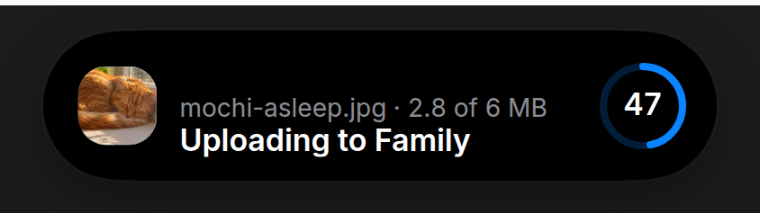
An upload that shows what it is sending. A posting app's upload leads with a thumbnail of the photo and a ring with the percentage in it; this preset does the same, and says in one sentence where the file is going. Render it while the upload runs and remove it when it's done; the activity starts on mount and ends on unmount.
## Install
```package-install
npx shadcn@latest add https://islandcn.dev/r/upload-activity.json
```
This writes `components/islandcn/upload-activity.tsx` and `media-row.tsx` (the thumbnail, the row and the ring it shares with the nearby transfer), plus the content kit and the engine if the project lacks them. Mount the island once first, see [Installation](/docs/installation).
## What it shows
- **Compact:** the photo's thumbnail on the leading side (24 pt, with continuous corners) and a ring with the percentage in it on the trailing side. At 100% the ring turns into a check.
- **Split:** its compact pair, in the pill or in the 62.18 wide capsule, where the thumbnail drops to 22 pt so the ring after it stays whole. When the split doesn't fit at all, the fallback is the ring alone.
- **Expanded:** one row, as tall as an incoming call. The thumbnail large on the leading side, then the file name in grey with the bytes sent after it ("2.5 of 6 MB"), over a white sentence that says where it goes ("Uploading to Family"), and the ring large on the trailing side. Done, the sentence reads "Uploaded to Family", the size is the total, and the ring is a check.
- **Without a photo:** leave out `src` and the thumbnail is a tile of the accent with the upload glyph, so a PDF or a video still has a picture.
- **With `onCancel`:** the large ring holds a stop square and pressing it calls `onCancel`, as a nearby share's ring does; the size still follows the file name, and without `totalBytes` the percentage goes there instead while it runs.
- **Updates:** the percentage in the large ring turns over its digits, and the ring fills with a short ease.
## Usage
```tsx components/upload-island.tsx
"use client";
import { UploadActivity } from "@/components/islandcn/upload-activity";
export const UploadIsland = ({ file, preview, progress }: { file: File; preview: string; progress: number }) => (
);
```
`preview` is any image URL for the file, such as `URL.createObjectURL(file)` for a photo. Pass `progress` from your own upload state; the ring eases between values, so updating it a few times a second is enough. Keep it mounted for a moment at 1 so the check shows, then unmount it.
To word it as a post, pass your own sentences: `title="Posting to your story"` and `doneTitle="Posted"`.
## Props
| Prop | Type | Default | Description |
| - | - | - | - |
| `fileName` | `string` | - | File name, the grey line in the expanded view. |
| `progress` | `number` | - | 0 to 1. At 1 it shows a check and the done sentence. |
| `src?` | `string` | - | The photo or video frame being uploaded, shown as its thumbnail. Without it, a tile with the upload glyph. |
| `totalBytes?` | `number` | - | Total size, for "2.5 of 6 MB" after the file name, and the size alone once it lands. Without it the name stands alone. |
| `destination?` | `string` | - | Where it's going, such as "Family", for "Uploading to Family". Without it the sentence is "Uploading". |
| `title?` | `string` | - | The white sentence while it uploads, such as "Posting to your story". Defaults to "Uploading to" the destination. |
| `doneTitle?` | `string` | - | The white sentence once it's done, such as "Posted". Defaults to "Uploaded to" the destination. |
| `accent?` | `string` | `blue` | Colour of the ring and the check. |
| `onCancel?` | `() => void` | - | Makes the expanded ring a stop button while it runs. Without `totalBytes`, the percentage follows the file name in its place. |
| `id?` | `string` | `"upload"` | Activity id. |
| `priority?` | `number` | `0` | Higher priority takes the main pill when two activities run. |
## Make it yours
Install this preset when it is exactly what you need. Otherwise open it in the [Playground](https://islandcn.dev/playground), change what each region shows and copy the code, or read its source for technique and build your own island on the engine.
---
# Timer
A countdown with the time left on the trailing side and pause and cancel buttons when expanded.
> For the full documentation index, see [llms.txt](https://islandcn.dev/llms.txt). Every page has a Markdown version: add `.md` to its URL or send `Accept: text/markdown`. To build an island, follow the islandcn agent skill at https://islandcn.dev/.well-known/agent-skills/islandcn/SKILL.md.
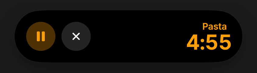
A countdown that ticks on its own. You pass when it ends (or how much is left while paused); the time in the island updates every second without re-rendering your component.
## Install
```package-install
npx shadcn@latest add https://islandcn.dev/r/timer-activity.json
```
This writes `components/islandcn/timer-activity.tsx`, plus the content kit and the engine if the project lacks them. Mount the island once first, see [Installation](/docs/installation).
## What it shows
- **Compact:** a timer glyph and the time left.
- **Split:** its compact pair, as the reference phone shows it, in the pill or in the 62.18 wide capsule. When the pair is too wide for the split, the fallback is a ring that empties as time runs out, with the time left beside it.
- **Expanded:** pause and cancel buttons when you pass handlers, the label, and the time left in large type.
- **Updates:** the time turns over its digits each second with the engine's `IslandNumber`. In the expanded view the time sits in a frame as tall as the buttons, so the two stay level on the top-aligned row.
## Usage
```tsx components/tea-timer.tsx
"use client";
import { useState } from "react";
import { TimerActivity, type TimerState } from "@/components/islandcn/timer-activity";
const TEA = 4 * 60_000;
// The timer starts from a click, not on render: reading the clock while rendering breaks static builds.
export const TeaTimer = () => {
const [state, setState] = useState(null);
return (
<>
{state ? (
setState((s) =>
s?.kind === "running" ? { kind: "paused", remaining: s.endsAt - Date.now() } : s && { kind: "running", endsAt: Date.now() + s.remaining },
)
}
onCancel={() => setState(null)}
onEnd={() => setState(null)}
/>
) : null}
);
};
```
## Props
| Prop | Type | Default | Description |
| - | - | - | - |
| `state` | `{ kind: "running"; endsAt: number } \| { kind: "paused"; remaining: number }` | - | Running with an end time (epoch ms), or paused with the time left (ms). |
| `duration` | `number` | - | Full length in ms, for the ring in the minimal fallback. |
| `label?` | `string` | `"Timer"` | Name in the expanded view. |
| `accent?` | `string` | `orange` | Accent colour. |
| `onToggle?` | `() => void` | - | Pause or resume button in the expanded view. |
| `onCancel?` | `() => void` | - | Cancel button in the expanded view. |
| `onEnd?` | `() => void` | - | Called when a running timer reaches zero. |
| `id?` | `string` | `"timer"` | Activity id. |
| `priority?` | `number` | `0` | Higher priority takes the main pill when two activities run. |
## Make it yours
Install this preset when it is exactly what you need. Otherwise open it in the [Playground](https://islandcn.dev/playground), change what each region shows and copy the code, or read its source for technique and build your own island on the engine.
---
# Now playing
Artwork on the leading side, a live level meter on the trailing side, transport controls when expanded.
> For the full documentation index, see [llms.txt](https://islandcn.dev/llms.txt). Every page has a Markdown version: add `.md` to its URL or send `Accept: text/markdown`. To build an island, follow the islandcn agent skill at https://islandcn.dev/.well-known/agent-skills/islandcn/SKILL.md.
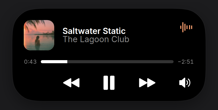
Music or a podcast. Without artwork it draws a gradient cover from the title and artist and takes its accent from it, so every track looks distinct.
## Install
```package-install
npx shadcn@latest add https://islandcn.dev/r/now-playing-activity.json
```
This writes `components/islandcn/now-playing-activity.tsx`, plus the content kit and the engine if the project lacks them. Mount the island once first, see [Installation](/docs/installation).
## What it shows
- **Compact:** the cover on the leading side and a moving six-bar level meter, tinted from the cover, on the trailing side.
- **Split:** its compact pair, as the reference phone shows it, in the pill or in the 62.18 wide capsule. When the pair is too wide for the split, the fallback is the cover and a smaller meter.
- **Expanded:** a 60 pt cover with the title (semibold, white) and artist (grey, the same 16 pt) beside it, the level meter in the top corner, a 6 pt white scrubber on a grey track between the elapsed and remaining times, and a transport row: previous, a large play or pause, and next centred on the island, and an audio output button (a speaker with sound waves) at the trailing end. Each button shows when you pass its handler.
- **Updates:** the elapsed and remaining times turn over their digits with the engine's `IslandNumber`, and the scrubber moves with `IslandProgress`.
## Usage
```tsx components/player-island.tsx
"use client";
import { NowPlayingActivity, type PlaybackState } from "@/components/islandcn/now-playing-activity";
interface Track {
title: string;
artist: string;
durationMs: number;
coverUrl: string;
}
interface PlayerIslandProps {
track: Track;
playback: PlaybackState;
toggle: () => void;
next: () => void;
}
export const PlayerIsland = ({ track, playback, toggle, next }: PlayerIslandProps) => (
);
```
`playback` is `{ kind: "playing", startedAt }` (the epoch ms the track would have started at to be where it is now) or `{ kind: "paused", position }` in ms. The scrubber moves on its own while playing.
## Props
| Prop | Type | Default | Description |
| - | - | - | - |
| `title` | `string` | - | Track title. |
| `artist` | `string` | - | Artist. |
| `duration` | `number` | - | Track length in ms. |
| `playback` | `{ kind: "playing"; startedAt: number } \| { kind: "paused"; position: number }` | - | Where playback is. |
| `artwork?` | `string` | `a generated gradient` | Cover image URL. |
| `accent?` | `string` | `taken from the generated art` | Accent for the level meter. |
| `onToggle?` | `() => void` | - | Play or pause button. |
| `onPrevious?` | `() => void` | - | Previous track button. |
| `onNext?` | `() => void` | - | Next track button. |
| `onOutput?` | `() => void` | - | Audio output button at the end of the transport row, to pick where the sound plays. |
| `id?` | `string` | `"now-playing"` | Activity id. |
| `priority?` | `number` | `0` | Higher priority takes the main pill when two activities run. |
## Make it yours
Install this preset when it is exactly what you need. Otherwise open it in the [Playground](https://islandcn.dev/playground), change what each region shows and copy the code, or read its source for technique and build your own island on the engine.
---
# Incoming call
A caller's name with accept and decline buttons, expanded while it rings, then a call timer.
> For the full documentation index, see [llms.txt](https://islandcn.dev/llms.txt). Every page has a Markdown version: add `.md` to its URL or send `Accept: text/markdown`. To build an island, follow the islandcn agent skill at https://islandcn.dev/.well-known/agent-skills/islandcn/SKILL.md.
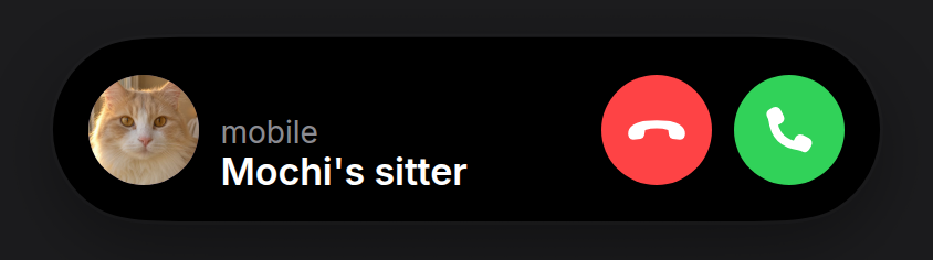
A ringing call takes over the island: it expands with the caller's photo, their name and two round buttons, and stays open until it's answered or declined. Once answered it settles to a compact call timer. Pass the contact's picture as `avatar`, whatever it is saved with: the example's sitter is saved under the cat they look after.
## Install
```package-install
npx shadcn@latest add https://islandcn.dev/r/call-activity.json
```
This writes `components/islandcn/call-activity.tsx`, plus the content kit and the engine if the project lacks them. Mount the island once first, see [Installation](/docs/installation).
## What it shows
- **Compact:** while ringing, the caller's avatar and a green phone glyph; on a call, a 241 pt pill, as the reference's: a handset and the call's length in semibold on the leading side and a two-tone level meter (green and orange bars with pale cores) on the trailing side, all in the light green the island uses for a live call (#76fb73), lighter than the accept button's.
- **Split:** its compact pair, as the reference phone shows it, in the pill or in the 62.18 wide capsule. When the pair is too wide for the split, the fallback is the phone glyph, with the call's length once answered.
- **Expanded:** while ringing, on the shortest island (84 pt): a 50 pt avatar (the photo, or initials without one), the kind of call in small grey type over the caller's name in white semibold, and 50 pt red decline and green accept buttons, a flat handset on one and a raised one on the other. On a call, the grey line becomes the call's length in green, and a level meter takes the accept button's place. Answering settles the island back to compact.
- **Updates:** the call's length turns over its digits with the engine's `IslandNumber`.
## Usage
```tsx components/call-island.tsx
"use client";
import { useState } from "react";
import { CallActivity, type CallState } from "@/components/islandcn/call-activity";
export const CallIsland = ({ caller, photo, onHangUp }: { caller: string; photo?: string; onHangUp: () => void }) => {
const [state, setState] = useState({ kind: "ringing" });
return (
setState({ kind: "active", since: Date.now() })}
onDecline={onHangUp}
/>
);
};
```
## Props
| Prop | Type | Default | Description |
| - | - | - | - |
| `caller` | `string` | - | Who is calling. |
| `state` | `{ kind: "ringing" } \| { kind: "active"; since: number }` | - | Ringing, or on a call since an epoch ms. |
| `onAccept` | `() => void` | - | Accept button while ringing. |
| `onDecline` | `() => void` | - | Decline while ringing, end while on a call. |
| `subtitle?` | `string` | `"Audio call"` | The small grey line over the name while ringing: the kind of call, such as "mobile" or "Video call". |
| `avatar?` | `string` | `the caller's initials` | The contact's photo, an image URL: a face, a pet, whatever the contact is saved with. The initials show while it loads. |
| `id?` | `string` | `"call"` | Activity id. |
| `priority?` | `number` | `2` | A call outranks most activities, so it takes the main pill. |
## Make it yours
Install this preset when it is exactly what you need. Otherwise open it in the [Playground](https://islandcn.dev/playground), change what each region shows and copy the code, or read its source for technique and build your own island on the engine.
---
# Ride or delivery ETA
Minutes until a ride or delivery arrives, with the driver, the vehicle and an optional Message button.
> For the full documentation index, see [llms.txt](https://islandcn.dev/llms.txt). Every page has a Markdown version: add `.md` to its URL or send `Accept: text/markdown`. To build an island, follow the islandcn agent skill at https://islandcn.dev/.well-known/agent-skills/islandcn/SKILL.md.
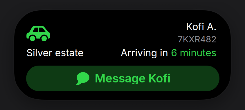
An arrival countdown, laid out the way the platform's design guidelines draw a delivery. Pass when it gets there and the minutes count down on their own.
## Install
```package-install
npx shadcn@latest add https://islandcn.dev/r/eta-activity.json
```
This writes `components/islandcn/eta-activity.tsx`, plus the content kit and the engine if the project lacks them. Mount the island once first, see [Installation](/docs/installation).
## What it shows
- **Compact:** a car (ride) or parcel (delivery) glyph (or a short `service` name) and the minutes left ("6 mins"), both in the accent, the colour the expanded car and minutes carry, so opening it keeps one colour (a `service` name stays white).
- **Split:** its compact pair, as the reference phone shows it, in the pill or in the 62.18 wide capsule. When the pair is too wide for the split, the fallback is the glyph and the minutes.
- **Expanded:** the vehicle glyph large in the accent, tight to the top-left corner beside the camera area. On the right, the driver's name, with the plate in grey under it, or stars when you pass `rating`. The next row has the car (or what is coming, such as "3 items") on the left and "Arriving in 6 minutes" on the right, with the minutes in the accent. With `onContact`, a full-width capsule at the foot reads "Message Kofi" beside a message glyph, in the accent on an accent tint.
- **Older props:** without `driverName`, the plate takes the name's place. A ride's `subtitle` of "plate · car" fills the plate and the car. `progress` is still accepted, but nothing shows it: the guideline layout has no route bar. `RouteBar` is still exported for your own layouts.
- **Updates:** the minutes turn over their digits with the engine's `IslandNumber`.
## Usage
```tsx components/ride-island.tsx
"use client";
import { EtaActivity } from "@/components/islandcn/eta-activity";
interface Ride {
/** Arrival time, in ms since the epoch. */
etaMs: number;
driver: string;
car: string;
plate: string;
}
export const RideIsland = ({ ride, onMessage }: { ride: Ride; onMessage: () => void }) => (
);
```
## Props
| Prop | Type | Default | Description |
| - | - | - | - |
| `arrivesAt` | `number` | - | When it gets there, epoch ms. |
| `title` | `string` | - | Headline, such as "Driver is on the way". Read by screen readers; shown top right only when there is no driver name or plate. |
| `driverName?` | `string` | - | Who is coming, such as "Kofi A.", top right. |
| `plate?` | `string` | - | The plate, under the driver's name or in its place. |
| `vehicle?` | `string` | - | What is coming, such as "Silver estate" or "3 items", on the left of the arrival row. |
| `onContact?` | `() => void` | - | Shows the full-width Message capsule and is called when it is pressed. |
| `contactLabel?` | `string` | `"Message "` | The capsule's words, such as "Contact Juan C.". |
| `rating?` | `number` | - | A rating out of 5, in halves: stars under the name in place of the plate. |
| `service?` | `string` | - | A short service name for compact's leading side, in place of the vehicle glyph. |
| `kind?` | `"ride" \| "delivery"` | `"ride"` | Picks the glyph. |
| `subtitle?` | `string` | - | The older form of plate and vehicle: "7KXR482 · Silver estate" for a ride. |
| `progress?` | `number` | - | Still accepted, no longer shown. |
| `accent?` | `string` | `green for rides, yellow for deliveries` | Accent colour: the glyph, the minutes and the capsule. |
| `id?` | `string` | `"eta"` | Activity id. |
| `priority?` | `number` | `0` | Higher priority takes the main pill when two activities run. |
## Make it yours
Install this preset when it is exactly what you need. Otherwise open it in the [Playground](https://islandcn.dev/playground), change what each region shows and copy the code, or read its source for technique and build your own island on the engine.
---
# Recording
A recording indicator with an elapsed timer and a level meter, for audio, screen or camera capture.
> For the full documentation index, see [llms.txt](https://islandcn.dev/llms.txt). Every page has a Markdown version: add `.md` to its URL or send `Accept: text/markdown`. To build an island, follow the islandcn agent skill at https://islandcn.dev/.well-known/agent-skills/islandcn/SKILL.md.
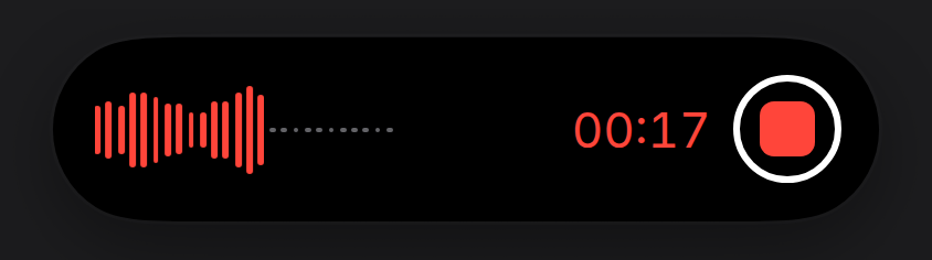
A waveform and the time elapsed, laid out as the system's voice recorder shows them. Feed it live levels from an `AnalyserNode` if you have them; without them it runs a built-in loop.
## Install
```package-install
npx shadcn@latest add https://islandcn.dev/r/recording-activity.json
```
This writes `components/islandcn/recording-activity.tsx`, plus the content kit and the engine if the project lacks them. Mount the island once first, see [Installation](/docs/installation).
## What it shows
- **Compact:** a red waveform and the elapsed time in red; both turn grey and hold still while paused. Screen and camera recordings show a pulsing red dot instead of the waveform.
- **Split:** in the 62.18 wide capsule, a short waveform (or the dot) alone. When the pair is too wide for the split, the fallback is the short waveform and the time.
- **Expanded:** one row, no title. On the left, the waveform: its bars grow from a centre line and scroll left while recording, with grey dots after them where the recording hasn't reached. On the right, the elapsed time in 22 pt red figures ("02:50"), then, with `onStop`, the stop button: a red rounded square in a thin white ring, concentric with the island's corner. With `onTogglePause`, a small grey pause or resume button sits at the left end, concentric with the other corner; leave it out to match the system's recorder, which has none. Screen and camera recordings show their glyph and title where the waveform goes.
- **Updates:** the time turns over its digits with the engine's `IslandNumber`.
## Usage
```tsx components/screen-recording.tsx
"use client";
import { RecordingActivity, type RecordingState } from "@/components/islandcn/recording-activity";
export const ScreenRecording = ({ state, stop, togglePause }: { state: RecordingState; stop: () => void; togglePause: () => void }) => (
);
```
`state` is `{ kind: "recording", since }` with the epoch ms it started (minus any paused time), or `{ kind: "paused", elapsed }` in ms.
## Props
| Prop | Type | Default | Description |
| - | - | - | - |
| `state` | `{ kind: "recording"; since: number } \| { kind: "paused"; elapsed: number }` | - | Recording since a moment, or paused with the length so far. |
| `kind?` | `"audio" \| "screen" \| "camera"` | `"audio"` | Picks the glyph and the default title. |
| `title?` | `string` | `"Voice memo", "Screen recording" or "Video"` | Names the recording in the labels, and in the expanded row for screen and camera. |
| `accent?` | `string` | `red` | Accent colour. |
| `onStop?` | `() => void` | - | Stop button at the right edge, a red square in a white ring. |
| `onTogglePause?` | `() => void` | - | Pause or resume button, a small grey circle at the left end. The system's recorder has none. |
| `levels?` | `readonly number[]` | `a built-in loop` | Live levels, 0 to 1, oldest first. The newest are the waveform's bars. |
| `id?` | `string` | `"recording"` | Activity id. |
| `priority?` | `number` | `0` | Higher priority takes the main pill when two activities run. |
## Make it yours
Install this preset when it is exactly what you need. Otherwise open it in the [Playground](https://islandcn.dev/playground), change what each region shows and copy the code, or read its source for technique and build your own island on the engine.
---
# Nearby transfer
A photo or file going to a device nearby, or coming from it: who it goes to, the photo on its corner, and a ring with a stop button.
> For the full documentation index, see [llms.txt](https://islandcn.dev/llms.txt). Every page has a Markdown version: add `.md` to its URL or send `Accept: text/markdown`. To build an island, follow the islandcn agent skill at https://islandcn.dev/.well-known/agent-skills/islandcn/SKILL.md.
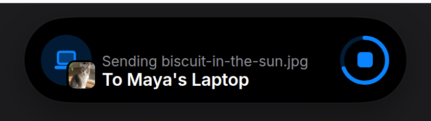
Sending to, or receiving from, a device nearby, laid out as a nearby share's banner: who it goes to, what is going (the photo, on the device's corner), and a ring with a stop button. It reads differently from the upload on purpose: the upload leads with the photo, this leads with the other device.
## Install
```package-install
npx shadcn@latest add https://islandcn.dev/r/nearby-transfer-activity.json
```
This writes `components/islandcn/nearby-transfer-activity.tsx` and `media-row.tsx` (the row, the ring and the device picture it shares with the upload), plus the content kit and the engine if the project lacks them. Mount the island once first, see [Installation](/docs/installation).
## What it shows
- **Compact:** the device's glyph in the accent on the leading side and a ring that fills on the trailing side, with a check at 100%.
- **Split:** its compact pair, which fits whole in the 62.18 wide capsule. When the split doesn't fit at all, the fallback is the device glyph inside the ring.
- **Expanded:** one row, as tall as an incoming call. The device on a faint disc of the accent, with a thumbnail of what is being sent on its lower corner, then "Sending biscuit-in-the-sun.jpg" in grey over "To Maya's Laptop" in white, and the ring large on the trailing side. With `onCancel` the ring holds a stop square that calls it; without, an arrow for the direction. Done, the grey line reads "Sent …" and the ring is a check.
- **Receiving:** `direction="receive"` reads "Receiving …" over "From Maya's Laptop", with the arrow pointing down when there is no stop button.
- **A person instead of a device:** pass `avatar` with their photo and it takes the device's place, in compact too.
## Usage
```tsx components/share-island.tsx
"use client";
import { NearbyTransferActivity } from "@/components/islandcn/nearby-transfer-activity";
export const ShareIsland = ({ progress, cancel }: { progress: number; cancel: () => void }) => (
);
```
`itemName` can be a count as well as a name: "3 photos" reads "Sending 3 photos".
## Props
| Prop | Type | Default | Description |
| - | - | - | - |
| `deviceName` | `string` | - | The other device's or person's name, such as "Maya's Laptop". |
| `itemName` | `string` | - | What is moving, such as "biscuit-in-the-sun.jpg" or "3 photos", in the grey line ("Sending 3 photos"). |
| `progress` | `number` | - | 0 to 1. At 1 it shows a check and "Sent" or "Received". |
| `src?` | `string` | - | A thumbnail of what is moving, set on the device's corner. Without it, no badge. |
| `avatar?` | `string` | - | The other person's photo, in place of the device. |
| `direction?` | `"send" \| "receive"` | `"send"` | Sending or receiving. |
| `device?` | `"phone" \| "tablet" \| "laptop" \| "desktop"` | `"phone"` | Picks the glyph when there is no avatar. |
| `accent?` | `string` | `blue` | Colour of the device, the ring and the check. |
| `onCancel?` | `() => void` | - | Makes the expanded ring a stop button while it runs. Without it the ring shows an arrow for the direction. |
| `id?` | `string` | `"nearby-transfer"` | Activity id. |
| `priority?` | `number` | `0` | Higher priority takes the main pill when two activities run. |
## Make it yours
Install this preset when it is exactly what you need. Otherwise open it in the [Playground](https://islandcn.dev/playground), change what each region shows and copy the code, or read its source for technique and build your own island on the engine.
---
# Battery
Charge level and charging state, shown briefly when power connects or runs low.
> For the full documentation index, see [llms.txt](https://islandcn.dev/llms.txt). Every page has a Markdown version: add `.md` to its URL or send `Accept: text/markdown`. To build an island, follow the islandcn agent skill at https://islandcn.dev/.well-known/agent-skills/islandcn/SKILL.md.
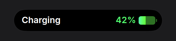
A battery for a device or accessory, shown as the system's charging indicator: one row, the label on the left and the level on the right. Plug in and the pill appears, its battery fills to the level, it holds for about two seconds and it goes. Expanding it opens the same row with one grey line under the label, not a card.
## Install
```package-install
npx shadcn@latest add https://islandcn.dev/r/battery-activity.json
```
This writes `components/islandcn/battery-activity.tsx`, plus the content kit and the engine if the project lacks them. Mount the island once first, see [Installation](/docs/installation).
## What it shows
- **Appearing:** the battery's charge fills in from empty over a second as the pill opens. With `dismissAfter` the pill leaves by itself that long after it appears, and comes back each time `charging` turns on again. While the island is open it waits, and leaves a beat after it closes. Reduced motion shows the level at once.
- **Compact:** the pill takes the widest sides the engine allows, 253 pt (the charging indicator is about 317). On the left, "Charging" (or "Charged" when full) in 15 pt semibold white, 14.5 pt in from the pill's end; unplugged, the device's `name` instead. On the right, the percentage at the same size and weight, then a 35.5 pt battery: a solid rounded body with the charge filled from the left, the empty part and the nub darker, and no bolt. While charging the percentage is green and the fill runs mint to lime. Red below `lowThreshold`, white otherwise. The label stays white in every state. If the percentage runs wide in a fallback font, the battery narrows before the spacing does.
- **Expanded:** a long press, `expand()` or `alertOnStart` opens the same row in the shortest expanded island the engine draws (84 pt tall), with one line under the label in 13 pt grey: "Full in 55 min" while charging below full with `timeToFull`; otherwise the device's `name` while charging or full, "Low battery" below `lowThreshold` and "Not charging" when unplugged. A battery with the default name that is full, or charging with no `timeToFull`, has nothing to add and shows the label alone ("Charged" already says it is full). The two lines and the battery are centred on the island's middle, both ends 18.5 pt in, clear of the island's content clip. No large number and no bar.
- **Split:** the battery alone in the 62.18 wide capsule, its fill the level. When the pair is too wide for the split, the fallback is the battery and the percentage.
- **Updates:** the percentage changes its digits in place without a jump in width.
- **Screen readers** hear the name, the percentage and the state, with the time until full while charging when you pass `timeToFull`.
## Usage
```tsx components/headphones-battery.tsx
"use client";
import { BatteryActivity, chargingIndicatorHold } from "@/components/islandcn/battery-activity";
export const HeadphonesBattery = ({ level, charging }: { level: number; charging: boolean }) => (
);
```
Keep it mounted while the device is connected: it shows when it mounts and each time `charging` turns on, then leaves after `chargingIndicatorHold` (3.3 s). Without `dismissAfter` it stays until you unmount it; a battery that sits in the island all day is noise.
## Props
| Prop | Type | Default | Description |
| - | - | - | - |
| `level` | `number` | - | Charge, 0 to 1. |
| `charging` | `boolean` | - | Plugged in and charging. |
| `timeToFull?` | `number` | - | Time until full in ms. Shown as "Full in 55 min" under the expanded label while charging below full, and heard by screen readers. The compact pill shows no time. |
| `lowThreshold?` | `number` | `0.2` | Below this the battery turns red. |
| `name?` | `string` | `"Battery"` | Device name, such as "Headphones": the label while unplugged, the line under the expanded label while charging with no time to full, and what screen readers hear. |
| `alertOnStart?` | `boolean` | `false` | Expand briefly when it appears. The system's charging indicator never does. |
| `dismissAfter?` | `number` | `none (stays while mounted)` | Leave the island this many ms after appearing, and show again for the same time each time `charging` turns on. Waits while the island is open. `chargingIndicatorHold` (3300) is the system's length. |
| `onDismiss?` | `() => void` | - | Called when it leaves by itself after `dismissAfter`. |
| `id?` | `string` | `"battery"` | Activity id. |
| `priority?` | `number` | `0` | Higher priority takes the main pill when two activities run. |
## Make it yours
Install this preset when it is exactly what you need. Otherwise open it in the [Playground](https://islandcn.dev/playground), change what each region shows and copy the code, or read its source for technique and build your own island on the engine.
---
# Split
Two activities at once: one stays attached to the pill, the other moves to a capsule beside it.
> For the full documentation index, see [llms.txt](https://islandcn.dev/llms.txt). Every page has a Markdown version: add `.md` to its URL or send `Accept: text/markdown`. To build an island, follow the islandcn agent skill at https://islandcn.dev/.well-known/agent-skills/islandcn/SKILL.md.
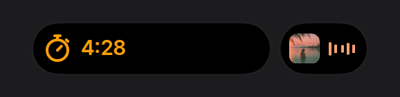
Not a component you need: the split is what the engine does whenever two activities run. This item installs the demo, a timer and music together, so you can see it and read how priority picks the sides.
## Install
```package-install
npx shadcn@latest add https://islandcn.dev/r/split-demo.json
```
This writes `components/islandcn/demos/split-demo.tsx` with its sample data, the shared content kit it builds on (`components/islandcn/theme.ts`, `glyph.tsx`, `island-text.tsx` and friends), and the engine in `lib/island/` if the project doesn't have it. Mount the island once first, see [Installation](/docs/installation).
## What it shows
- **The attached pill** shows the primary activity (highest `priority`, then first started). It grows only to the left of the sensor and keeps its right end at the sensor's edge.
- **The capsule** to its right shows the second activity. It pinches off the pill with a gooey neck when the second activity starts and merges back when either ends.
- On the reference phone both shapes show their activity's compact pair: here the timer's glyph and time in the pill, and the cover and meter in the capsule. The capsule is 62.18 wide whatever its trailing value, which leaves about 20 pt after the glyph, so the meter fits and a four-character time would be cut. That is why music, not the timer, takes the capsule in this demo.
- Each preset also passes a `MinimalPair` as its `minimal` view, the fallback when the two pairs together are wider than 290.
- Hold either shape to expand that activity.
## Usage
```tsx components/kitchen.tsx
"use client";
import { NowPlayingActivity } from "@/components/islandcn/now-playing-activity";
import { TimerActivity } from "@/components/islandcn/timer-activity";
// The timer has the higher priority, so it takes the attached pill.
export const Kitchen = ({ endsAt, startedAt }: { endsAt: number; startedAt: number }) => (
<>
);
```
The item also writes `components/islandcn/demos/demo-stage.tsx`, the phone-width stage the demo runs on.
## Props
### `SplitDemo`
| Prop | Type | Default | Description |
| - | - | - | - |
| `primary?` | `"timer" \| "music"` | `"timer"` | Which activity takes the attached pill. |
| `view?` | `"live" \| "compact" \| "expanded"` | `"live"` | Island state to hold. |
| `height?` | `number` | `300` | Stage height in px. |
| `theme?` | `Partial` | `the light stage` | Stage colours, merged over the light screen. |
| `reducedMotion?` | `"user" \| "always" \| "never"` | `"user"` | The island's reduced-motion setting. |
## Make it yours
Install this preset when it is exactly what you need. Otherwise open it in the [Playground](https://islandcn.dev/playground), change what each region shows and copy the code, or read its source for technique and build your own island on the engine.
---
# Island
Draws the activity stack from the nearest IslandProvider at the top centre of its container or of the window.
> For the full documentation index, see [llms.txt](https://islandcn.dev/llms.txt). Every page has a Markdown version: add `.md` to its URL or send `Accept: text/markdown`. To build an island, follow the islandcn agent skill at https://islandcn.dev/.well-known/agent-skills/islandcn/SKILL.md.
```tsx
import { Island } from "@/lib/island";
```
## ``
Renders the pill. Put one inside the provider; it shows whatever the stack holds.
```tsx
import { Island, IslandProvider } from "@/lib/island";
import { App } from "./app";
export const Root = () => (
);
```
### Props
```ts
import type { CSSProperties } from "react";
interface IslandProps {
placement?: "container" | "viewport"; // default "container"
label?: string; // region name, default "Live activities"
className?: string;
style?: CSSProperties;
keyline?: "auto" | "on" | "off"; // default "auto"
backdrop?: string; // page colour behind the island, sets keyline strength
}
```
| Prop | Type | Default | Description |
| - | - | - | - |
| `placement?` | `"container" \| "viewport"` | `"container"` | "container" draws at the top centre of the nearest positioned ancestor, like a phone screen. "viewport" pins it to the top centre of the window. |
| `label?` | `string` | `"Live activities"` | Name of the island region for screen readers. |
| `className?` | `string` | - | Class on the region element. |
| `style?` | `CSSProperties` | - | Style on the region element. |
| `keyline?` | `"auto" \| "on" \| "off"` | `"auto"` | The thin grey band outside the edge that keeps the island visible on a dark page. "auto" draws it when backdrop is dark, or in dark mode when no backdrop is given. See Keyline. |
| `backdrop?` | `string` | - | The page colour behind the island, hex or rgb(). Its brightness sets the keyline's strength. |
### Size
Sizes are CSS pixels, one per point on the reference phone. Containers wider than a phone clamp the island to phone width (402), so the expanded view is 374 wide everywhere and the pill never stretches across a desktop window.
### Interaction and accessibility
- The island is a `region` with the `label` above. The pill is a real `button` named after the activity, with `aria-expanded`. A polite live region reads activity labels when they change.
- Every press swells the pill from touch-down. Still held at 0.1 s, it is a long-press and the island expands at `motion.longPress` (0.22 s after touch-down). Released sooner, it is a tap: the activity's `onPress` runs and the swell springs back. Hold the detached capsule to expand the second activity. See [Long-press and taps](/docs/guides/actions).
- Enter or Space toggles expanded. Escape, or a press outside the island, collapses it. Focus inside content that goes away moves back to the pill.
- Expanded content takes pointer events and focus, so buttons inside it work.
`` throws if it has no `IslandProvider` above it.
## IslandView
A controlled island: you say which presentation to show and what goes in it, and it springs there when either changes. It ignores the activity stack and isn't pressable, which makes it the right tool for a preview, a design tool or a frame-by-frame capture.
```tsx
import { TitleStack } from "@/components/islandcn/island-text";
import { LinearProgress } from "@/components/islandcn/linear-progress";
import { ProgressRing } from "@/components/islandcn/progress-ring";
import { IslandView } from "@/lib/island";
export const UploadPreview = () => (
,
center: ,
bottom: ,
}}
/>
);
```
### Props
```ts
import type { CSSProperties, ReactNode } from "react";
import type { CompactContent, IslandClock, IslandMetricsOverrides, IslandMotionOverrides } from "@/lib/island";
interface IslandViewProps {
presentation:
| { kind: "idle" }
| { kind: "compact"; leading?: ReactNode; trailing?: ReactNode }
| { kind: "minimal"; attached: ReactNode; detached?: ReactNode; split?: { attached: CompactContent; detached: CompactContent } }
| { kind: "expanded"; leading?: ReactNode; trailing?: ReactNode; center?: ReactNode; bottom?: ReactNode };
contentKey?: string; // new key crossfades, same key updates in place
pressed?: boolean; // the hold squish
placement?: "container" | "viewport";
label?: string;
liveLabel?: string;
clock?: IslandClock;
metrics?: IslandMetricsOverrides;
motion?: IslandMotionOverrides;
reducedMotion?: "user" | "always" | "never";
className?: string;
style?: CSSProperties;
keyline?: "auto" | "on" | "off";
backdrop?: string;
}
```
| Prop | Type | Default | Description |
| - | - | - | - |
| `presentation` | `IslandPresentation` | - | The shape and its content. minimal with split draws the split as the reference phone shows it: each shape shows its { leading, trailing } pair, the capsule at its fixed 62.18 width. attached and detached are the fallback views for content too wide for that, and the whole view when there is no split. |
| `contentKey?` | `string` | `presentation.kind` | A new key crossfades the content; the same key updates it in place. |
| `pressed?` | `boolean` | `false` | Draws the hold swell, as if a finger were on the pill. |
| `placement?` | `"container" \| "viewport"` | `"container"` | Same as on Island. |
| `label?` | `string` | `"Live activity"` | Region name for screen readers. |
| `liveLabel?` | `string` | - | Text the polite live region reads. |
| `clock?` | `IslandClock` | `the provider's, or a requestAnimationFrame clock` | Where time comes from. |
| `metrics?` | `IslandMetricsOverrides` | `the provider's, or none` | Geometry overrides. |
| `motion?` | `IslandMotionOverrides` | `the provider's, or none` | Spring overrides. |
| `reducedMotion?` | `"user" \| "always" \| "never"` | `the provider's, or "user"` | Reduced-motion setting. |
| `className, style?` | | - | On the region element. |
| `keyline?` | `"auto" \| "on" \| "off"` | `"auto"` | The thin grey band outside the edge that keeps the island visible on a dark page. "auto" draws it when backdrop is dark, or in dark mode when no backdrop is given. See Keyline. |
| `backdrop?` | `string` | - | The page colour behind the island, hex or rgb(). Its brightness sets the keyline's strength. |
`IslandView` works inside or outside a provider. Inside one, it uses the provider's clock, metrics and motion.
---
# IslandProvider
Owns the activity stack and the clock for every Island and useIsland below it, and takes the metrics, motion and reduced-motion settings.
> For the full documentation index, see [llms.txt](https://islandcn.dev/llms.txt). Every page has a Markdown version: add `.md` to its URL or send `Accept: text/markdown`. To build an island, follow the islandcn agent skill at https://islandcn.dev/.well-known/agent-skills/islandcn/SKILL.md.
```tsx
import { IslandProvider } from "@/lib/island";
```
## ``
Wrap your app once, as high as the components that start activities. Everything below it shares one island.
```tsx
import { Island, IslandProvider } from "@/lib/island";
import { App } from "./app";
export const Root = () => (
);
```
### Props
```ts
import type { ReactNode } from "react";
import type { IslandClock, IslandMetricsOverrides, IslandMotionOverrides, IslandSequence } from "@/lib/island";
interface IslandProviderProps {
children: ReactNode;
clock?: IslandClock; // read once; default requestAnimationFrame
devtools?: boolean | { sequences?: Record }; // default false
metrics?: IslandMetricsOverrides; // deep-partial overrides of islandMetrics
motion?: IslandMotionOverrides; // deep-partial overrides of islandMotion
reducedMotion?: "user" | "always" | "never"; // default "user"
}
```
| Prop | Type | Default | Description |
| - | - | - | - |
| `children` | `ReactNode` | - | Your app. |
| `clock?` | `IslandClock` | `a requestAnimationFrame clock` | Where island time comes from. Read once, on mount. Pass a stepped clock for captures and tests. |
| `devtools?` | `boolean \| { sequences }` | `false` | Installs window.__islandcn (pause, step, seek, play) for frame-exact captures. Leave it off in production. |
| `metrics?` | `IslandMetricsOverrides` | - | Deep-partial overrides of islandMetrics, the geometry table. |
| `motion?` | `IslandMotionOverrides` | - | Deep-partial overrides of islandMotion, the spring and timing table. |
| `reducedMotion?` | `"user" \| "always" \| "never"` | `"user"` | "user" follows prefers-reduced-motion; the others force it on or off. |
### Overriding springs and sizes
Both tables merge one group at a time, so you pass only what you change:
```tsx
import { Island, IslandProvider } from "@/lib/island";
import { App } from "./app";
export const Root = () => (
);
```
`motion` can change while the island runs; the next transition uses the new springs. The [Playground](https://islandcn.dev/playground) writes this prop for you. The tables and every key are listed in [Motion and springs](/docs/guides/motion).
### Notes
- It renders on the client. In the Next.js App Router, render it from a `"use client"` file, see [Installation](/docs/installation).
- One provider per island. Two providers draw two independent islands.
---
# useIsland
The hook that starts, updates, expands and ends activities, and reports what the island shows.
> For the full documentation index, see [llms.txt](https://islandcn.dev/llms.txt). Every page has a Markdown version: add `.md` to its URL or send `Accept: text/markdown`. To build an island, follow the islandcn agent skill at https://islandcn.dev/.well-known/agent-skills/islandcn/SKILL.md.
```tsx
import { useIsland, useIslandActions, useIslandReducedMotion } from "@/lib/island";
```
## `useIsland()`
Call it in any component under an `IslandProvider`. The returned object is stable, so it is safe in effect dependencies. Reading `activities` or `presentation` during render re-renders the component when they change.
```tsx
"use client";
import { CompactText } from "@/components/islandcn/island-text";
import { ProgressRing } from "@/components/islandcn/progress-ring";
import { useIsland } from "@/lib/island";
export const useUpload = () => {
const island = useIsland();
return () => {
const upload = island.start({
id: "upload",
label: "Uploading report.pdf",
compact: { leading: , trailing: 40% },
minimal: ,
});
island.expand("upload"); // what a long-press does
island.collapse();
upload.end();
};
};
```
### Returns
```ts
import type { Activity, ActivityHandle, ActivityOptions, ActivityUpdate } from "@/lib/island";
interface IslandApi {
start(options: ActivityOptions): ActivityHandle; // same id again updates it
update(id: string, update: ActivityUpdate): void;
end(id: string): void; // dismiss with the system motion
expand(id?: string): void; // default: the primary activity
collapse(): void;
readonly activities: readonly Activity[]; // primary first, hidden group members included
readonly presentation: "idle" | "compact" | "minimal" | "expanded";
}
```
| Member | Description |
| --- | --- |
| `start(options)` | Adds an activity and returns its [handle](/docs/api/use-island#activityhandle). Starting the same `id` again updates it instead. See [ActivityOptions](/docs/api/activity-options) |
| `update(id, update)` | Changes a running activity. Nested content merges, so `{ compact: { trailing } }` keeps the leading slot |
| `end(id)` | Removes the activity with the dismiss motion |
| `expand(id?)` | Expands an activity, the primary one by default. It stays expanded until a press outside, Escape or `collapse()`. On an activity hidden in a group, it brings that one forward |
| `collapse()` | Returns to compact (or the split, with two activities) |
| `activities` | Running activities, primary first. Primary means highest `priority`, then first started, among those on show. Activities hidden in a [group](/docs/guides/activities#groups) are listed too; each has a `group` field |
| `presentation` | What the island shows now |
`useIsland()` throws if no `IslandProvider` is above the component.
## `useIslandActions()`
Returns the same `IslandApi` without subscribing, and throws without a provider the same way: the component never re-renders because the island changed. Use it in components that only start, update and end activities, such as the content kit's `useActivity`. Reading `activities` or `presentation` from it gives the current value at the time you read it.
```tsx
"use client";
import { Glyph } from "@/components/islandcn/glyph";
import { PackageGlyph } from "@/components/islandcn/glyphs";
import { useIslandActions } from "@/lib/island";
export const OrderButton = () => {
const island = useIslandActions();
return ;
};
```
## `useIslandReducedMotion()`
Returns `true` when the island runs reduced motion: the provider's `reducedMotion` setting resolved against the system's `prefers-reduced-motion`. Use it to turn off your own animations inside activity content. See [Reduced motion](/docs/guides/motion#reduced-motion).
## ActivityHandle
```ts
import type { ActivityUpdate } from "@/lib/island";
interface ActivityHandle {
readonly id: string;
update(update: ActivityUpdate): void;
end(): void;
}
```
```tsx
"use client";
import { CompactText, ExpandedTitle } from "@/components/islandcn/island-text";
import { useIslandActions } from "@/lib/island";
export const useUploadIsland = () => {
const island = useIslandActions();
return () => {
const upload = island.start({ id: "upload", compact: { trailing: 0% } });
upload.update({ compact: { trailing: 80% } });
upload.update({ alert: true, expanded: { center: Upload finished } });
upload.end();
};
};
```
| Member | Description |
| --- | --- |
| `id` | The activity's id |
| `update(update)` | Same as `island.update(id, update)`. Nested content merges. See [ActivityUpdate](/docs/api/activity-options#activityupdate) |
| `end()` | Same as `island.end(id)`: removes the activity with the dismiss motion. With nothing else running, the pill returns to idle |
The handle holds no state of its own, so you can drop it and call `island.update(id, ...)` later with the same id.
---
# ActivityOptions
The object you pass to start: an id, a label, a priority, and the content for compact, minimal and expanded.
> For the full documentation index, see [llms.txt](https://islandcn.dev/llms.txt). Every page has a Markdown version: add `.md` to its URL or send `Accept: text/markdown`. To build an island, follow the islandcn agent skill at https://islandcn.dev/.well-known/agent-skills/islandcn/SKILL.md.
```tsx
import type { ActivityOptions, ActivityUpdate } from "@/lib/island";
```
## `ActivityOptions`
```ts
import type { ReactNode } from "react";
interface ActivityOptions {
id: string;
label?: string; // spoken by screen readers, default the id
priority?: number; // default 0
onPress?: () => void; // tap (shorter than a long-press)
alert?: boolean; // expand briefly on start
group?: string; // share a group to show one at a time
compact?: { leading?: ReactNode; trailing?: ReactNode };
minimal?: ReactNode;
expanded?: { leading?: ReactNode; trailing?: ReactNode; center?: ReactNode; bottom?: ReactNode };
}
```
| Prop | Type | Default | Description |
| - | - | - | - |
| `id` | `string` | - | Stable name. start with the same id updates the running activity. |
| `label?` | `string` | `the id` | Read by screen readers, and the pill button's name. |
| `priority?` | `number` | `0` | With two activities, the higher priority takes the attached pill; ties go to the first started. |
| `onPress?` | `() => void` | - | Called on a tap, a press shorter than the long-press. |
| `alert?` | `boolean` | `false` | Expand briefly on start, like an alerting live status activity. |
| `group?` | `string` | - | Activities with the same group show one at a time, as one app's live status activities do. See Groups. |
| `compact?` | `{ leading, trailing }` | - | Either side of the sensor. Each side fits its own content, up to 72 wide; a longer plain string ends in an ellipsis. With content on both sides, the shorter side grows to 0.7475 of the other. Also what the split shows. See Layout rules. |
| `minimal?` | `ReactNode` | `compact.leading` | Shown when the island splits and the compact pair is too wide for the split. See Split. |
| `expanded?` | `{ leading, trailing, center, bottom }` | - | Top row of leading, center, trailing, then bottom across the full width. leading and trailing start at the top, center below the sensor. Height follows the content, from 84 to 180. |
Every content slot takes any React node.
## `ActivityUpdate`
What `update` takes. Every field is optional, and nested content merges: `{ compact: { trailing } }` keeps the leading slot. To clear a slot, pass it as `undefined` explicitly.
```ts
import type { ReactNode } from "react";
interface ActivityUpdate {
compact?: { leading?: ReactNode; trailing?: ReactNode };
minimal?: ReactNode;
expanded?: { leading?: ReactNode; trailing?: ReactNode; center?: ReactNode; bottom?: ReactNode };
label?: string;
priority?: number;
onPress?: () => void;
alert?: boolean; // expanded for motion.alertHold, then back
transition?: "update" | "crossfade"; // default "update" (in place)
}
```
`alert: true` on an update expands the island with the old content, applies the update 0.12 s later (`motion.alertContentDelay`), and returns to compact after `motion.alertHold` (5.975 s). See [Alerts](/docs/guides/actions#alerts).
`transition: "crossfade"` replaces the content layer with a blur and fade, for content that is different rather than newer. The default, `"update"`, changes it in place, so `IslandNumber` and `IslandProgress` animate the change. See [Numbers and progress](/docs/guides/activities#numbers-and-progress).
---
# IslandNumber and IslandProgress
Content primitives that animate a changed number or a moving bar on the island's clock, as a live status activity's content does.
> For the full documentation index, see [llms.txt](https://islandcn.dev/llms.txt). Every page has a Markdown version: add `.md` to its URL or send `Accept: text/markdown`. To build an island, follow the islandcn agent skill at https://islandcn.dev/.well-known/agent-skills/islandcn/SKILL.md.
```tsx
import { IslandNumber, IslandProgress, numberMotion } from "@/lib/island";
```
Both run on the island's clock, so captures and stepped clocks see the same frames, and both follow the provider's reduced-motion setting. Use them inside activity content; outside a provider they use a `requestAnimationFrame` clock and the system's setting. When to use them rather than a crossfade is in [Numbers and progress](/docs/guides/activities#numbers-and-progress).
## ``
Text whose changed characters turn over with a blur when `value` changes.
```tsx
import { IslandNumber } from "@/lib/island";
export const Percent = ({ percent }: { percent: number }) => (
);
```
```ts
import type { CSSProperties } from "react";
interface IslandNumberProps {
value: number | string;
className?: string;
style?: CSSProperties;
}
```
| Prop | Type | Default | Description |
| - | - | - | - |
| `value` | `number \| string` | - | The value. Numbers render with toString(); pass a string such as "4:07" to format it yourself. |
| `className?` | `string` | - | Class on the wrapper. |
| `style?` | `CSSProperties` | - | Style on the wrapper: font size, weight, colour. |
The old and new text are aligned from the right, and only the characters that changed move. Use tabular figures (`fontVariantNumeric: "tabular-nums"`) so the width holds still. The wrapper is an `inline-flex` with an `aria-label` of the whole text; screen readers read the value once, not per digit. Because it is not plain text, a slot too narrow for it clips it rather than ending it in an ellipsis.
`numberMotion` holds the timing, measured on the simulator: the old character shrinks to 0.7 and blurs from 0.03 to 0.21 s, then fades out by 0.26 s; the new one starts at 0.2 s, fades in within 0.08 s, grows from 0.72 and is sharp by about 0.48 s. Under reduced motion the text changes with a plain fade.
## ``
A capsule bar whose fill springs to each new value.
```tsx
import { IslandProgress } from "@/lib/island";
export const Charge = ({ level }: { level: number }) => ;
```
```ts
import type { CSSProperties } from "react";
import type { SpringConfig } from "@/lib/island";
interface IslandProgressProps {
value: number;
color?: string;
track?: string;
height?: number;
radius?: number;
spring?: SpringConfig;
className?: string;
style?: CSSProperties;
}
```
| Prop | Type | Default | Description |
| - | - | - | - |
| `value` | `number` | - | Fill from 0 to 1. |
| `color?` | `string` | `"#30D158"` | Fill colour. |
| `track?` | `string` | `"#414141"` | Track colour. |
| `height?` | `number` | `8` | Bar height in px. |
| `radius?` | `number` | `half the height` | Corner radius in px. |
| `spring?` | `{ response, dampingFraction }` | `{ response: 0.97, dampingFraction: 0.74 }` | How the fill moves to a new value, fitted on the simulator's bar. |
| `className?` | `string` | - | Class on the track. |
| `style?` | `CSSProperties` | - | Style on the track. |
The track is a `progressbar` with `aria-valuenow` from 0 to 100. If you wrap it in your own labelled progress bar, hide this one with `aria-hidden`, as the content kit's `LinearProgress` does. Under reduced motion the fill eases to the new value over 0.2 s with no overshoot.
---
# Content kit
The pieces island content is built from: text styles, layout frames, glyphs, rings, bars, steps, sparklines, readings and clocks, one registry item each.
> For the full documentation index, see [llms.txt](https://islandcn.dev/llms.txt). Every page has a Markdown version: add `.md` to its URL or send `Accept: text/markdown`. To build an island, follow the islandcn agent skill at https://islandcn.dev/.well-known/agent-skills/islandcn/SKILL.md.
The engine draws the pill and moves it. What goes inside is yours, and the content kit gives you pieces measured to fit it. The presets are built from them, and so is any island you write. Each is a registry item; add the ones you need:
```bash
npx shadcn@latest add https://islandcn.dev/r/island-content.json https://islandcn.dev/r/step-progress.json https://islandcn.dev/r/sparkline.json
```
`island-content` comes with every other item. None of them adds an npm package.
## `island-content`
The base every island uses.
| Import | What it gives you |
| --- | --- |
| `@/components/islandcn/theme` | `islandAccent` (one colour per activity), `islandInk` (white, secondary and tertiary grey, track, fill), `islandSize`, `islandLine`, `islandRow` (lines of the expanded top row), `islandSafe` (insets that keep content clear of the corner arcs), `trackingFor(size)`, `continuousCorner(w, h, radius)`, `tint(hex, alpha)`, `islandFont`, `islandMono` |
| `@/components/islandcn/glyphs` | islandcn's own glyph set on a 22 pt grid: media, calls, status, tasks, capture, travel, devices |
| `@/components/islandcn/glyph` | `Glyph` (a glyph sized to the pill; also takes an icon from another set such as Phosphor) and `IconTile` |
| `@/components/islandcn/island-text` | `CompactText`, `ExpandedTitle`, `ExpandedSubtitle`, `ContextLabel`, `ExpandedValue`, `Caption`, `TitleStack`, `NumberText`, `MinimalPair`, `withBubble` and `BubbleForm`, `Swap` |
| `@/components/islandcn/island-layout` | `SensorRow`, `BottomBar`, `ExpandedSide`, `ExpandedBottom`, `ValueStack`, `CaptionButton`, `cornerClearance` |
| `@/components/islandcn/use-activity` | `useActivity(build, deps)` and `useLatest(value)` |
Two pieces solve problems you will meet on almost every island:
- **`SensorRow`** is the row beside the sensor in a label-led view: a small glyph and a `ContextLabel` saying what is happening on the leading side, a time, a caption or a 26 pt control on the trailing side. It is about 100 pt wide, so a label holds eight or nine characters. Put a longer name in the bottom title.
- **`withBubble(compact, bubble)`** gives a compact pair a second form for the split capsule, which has about 20 pt after its glyph. "18 min", "B32" or "4:31" would end in an ellipsis there; `bubble` (a ring, the glyph, two digits) shows instead. `` does the same for one slot.
```tsx
import { Glyph } from "@/components/islandcn/glyph";
import { PackageGlyph } from "@/components/islandcn/glyphs";
import { BubbleForm, CompactText, withBubble } from "@/components/islandcn/island-text";
import { ProgressRing } from "@/components/islandcn/progress-ring";
import { islandAccent } from "@/components/islandcn/theme";
// "18 min" in the pill, "18" in the capsule.
export const orderTrailing = (minutes: number) => (
{minutes}}>
{minutes} min
);
// The whole pair swaps to a ring in the capsule.
export const syncCompact = (progress: number) =>
withBubble(
{ leading: , trailing: {Math.round(progress * 100)}% },
,
);
```
## Progress and time
| Item | Exports | Use it for |
| --- | --- | --- |
| `progress-ring` | `ProgressRing`, `IconRing` | Progress in compact or the capsule (20 pt), an icon in a ring that fills |
| `linear-progress` | `LinearProgress`, `TimeProgress` | A bar in `BottomBar`; a bar that fills with time by itself, such as a scrubber |
| `step-progress` | `StepProgress`, `stepsAt` | Named stages (an order, a build) as segments, or counted rounds (focus sessions, sets) as dots |
| `countdown-ring` | `CountdownRing` | A ring that runs down to a moment by itself: a code that expires, a session, a hold |
| `ticking-time` | `TickingTime`, `formatClock`, `formatMinutes` | A clock that counts up or down without re-rendering your component |
| `spinner`, `shimmer-text` | `Spinner`, `ShimmerText` | Work with no known end |
```tsx
import { BottomBar } from "@/components/islandcn/island-layout";
import { StepProgress, stepsAt } from "@/components/islandcn/step-progress";
import { islandAccent } from "@/components/islandcn/theme";
// Step 3 of 5 failed: two segments green, the third red, two waiting.
export const buildSteps = (
);
```
## Values and text
| Item | Exports | Use it for |
| --- | --- | --- |
| `sparkline` | `Sparkline` | A trend: 30 pt wide in compact, or the full width of the expanded view with `area` and a `baseline` |
| `metric` | `Metric`, `MetricRow` | Two to four labelled readings across the expanded view: heart rate, pace, distance; gate, seat, boarding |
| `tail-text` | `TailText` | One growing line that keeps its newest words in view: a transcript, a translation, an agent's output |
| `level-meter` | `LevelMeter` | Sound or voice levels, animated or from live input |
```tsx
import { ExpandedBottom } from "@/components/islandcn/island-layout";
import { MetricRow } from "@/components/islandcn/metric";
import { Sparkline } from "@/components/islandcn/sparkline";
import { islandAccent } from "@/components/islandcn/theme";
export const runReadings = (heartHistory: readonly number[]) => (
);
```
## Pictures and controls
| Item | Exports | Use it for |
| --- | --- | --- |
| `artwork` | `Artwork` | A cover or any square picture with the island's continuous corner; `src` for your image |
| `avatar` | `Avatar` | A person, a team or a shop: a monogram, or a photo or crest through `src` |
| `island-button` | `IslandButton`, `IslandRoundButton` | Approve and Deny, Pay, Pause and Skip, with a 44 pt touch area |
For a shape the glyph set doesn't draw, such as a heart, a plane or a lock, use an open icon set: Phosphor's icons go straight into `Glyph`'s `icon`.
The [agent skill's recipes](https://islandcn.dev/.well-known/agent-skills/islandcn/references/recipes.md) put these together into complete islands: stages, two sides, readings, a price, a code that expires and a transcript.
---
# Agent skill
An optional install helper for coding agents: the islandcn skill sets up the engine and wires an activity to your app.
> For the full documentation index, see [llms.txt](https://islandcn.dev/llms.txt). Every page has a Markdown version: add `.md` to its URL or send `Accept: text/markdown`. To build an island, follow the islandcn agent skill at https://islandcn.dev/.well-known/agent-skills/islandcn/SKILL.md.
If you build with a coding agent (Claude Code, Codex, Cursor), the islandcn skill helps it install the engine and wire an activity to your app's real state. It is a folder of Markdown the agent reads; you don't need it to use islandcn.
```package-install
npx shadcn@latest add https://islandcn.dev/r/islandcn-skill.json
```
It installs `island-core` if the project lacks it and writes the skill to `.agents/skills/islandcn/` and `.claude/skills/islandcn/`. Agents can also read it without installing it, at [/.well-known/agent-skills/islandcn/SKILL.md](https://islandcn.dev/.well-known/agent-skills/islandcn/SKILL.md) (index: [/.well-known/agent-skills/index.json](https://islandcn.dev/.well-known/agent-skills/index.json)).
## For tools
Plain-text versions of these docs, for tools that read them: [/llms.txt](https://islandcn.dev/llms.txt) lists every page, and [/llms-full.txt](https://islandcn.dev/llms-full.txt) holds them all in one file. Every docs page is also available as Markdown at its own path with `.md` added.
---
# How it's measured
islandcn's sizes and springs come from simulator recordings of the reference phone, compared with the web version frame by frame.
> For the full documentation index, see [llms.txt](https://islandcn.dev/llms.txt). Every page has a Markdown version: add `.md` to its URL or send `Accept: text/markdown`. To build an island, follow the islandcn agent skill at https://islandcn.dev/.well-known/agent-skills/islandcn/SKILL.md.
islandcn aims to match the reference phone's island closely enough that you can't tell them apart at normal speed. That needs ground truth, not guesses from screenshots.
## The reference
Ground truth comes from simulator recordings of the reference phone: a 402 by 874 pt screen with the sensor housing at its top. A small sample app starts a live status activity whose content is plain shapes, system-font text and solid colours, so the web can draw exactly the same thing. No system symbol fonts and no platform artwork go into the sample or into islandcn.
The sample is recorded through the same sequences the engine has to get right:
| Sequence | What happens |
| --- | --- |
| `appear` | An activity starts: idle to compact |
| `expand` | A long-press: compact to expanded |
| `collapse` | Expanded back to compact |
| `split` | A second activity starts: compact to minimal plus a detached bubble |
| `unsplit` | The second activity ends |
| `alert` | An alerting update opens the expanded view briefly |
| `dismiss` | The activity ends: back to idle |
From the recordings come the numbers the engine uses: pill sizes in each state, corner radii, the gap from the top of the screen, padding, type sizes, and the response and damping of each spring, read frame by frame. They live in `reference/MEASUREMENTS.md` in the repository and in one constants table in the engine.
## The numbers
From the simulator at 3x, in points:
| State | Width | Height | From the top | Corner |
| --- | --- | --- | --- | --- |
| Idle | 94.85 | 36.84 | 13.91 | capsule |
| Compact (22 pt glyph and "42") | 150.18 | 36.85 | 13.91 | capsule |
| Held, just before it expands | 168.34 | 41.29 | 11.70 | capsule |
| Expanded | 374.34 | 104.52 for that content | 13.83 | 48.2, continuous |
| Split: attached pill and capsule | 156.85 and 62.18, 7.82 apart | 36.85 | 13.91 | capsules |
Every corner is continuous: a circular arc that eases into the straight edges (smoothing 0.72 fits the frames in every state at under 0.1 pt). Compact grows outward from the idle box, so it sits a little off centre when its two sides differ, within the balance rule in [Layout rules](/docs/guides/presentations#layout-rules). Expanded is 13.83 from both sides and the top, which makes it concentric with the screen corner. Only the expanded state casts a shadow, and the pill's outline stays sharp through every morph: only the content blurs.
The springs fitted to the same recordings are in [Motion and springs](/docs/guides/motion).
## Held-out content
Rules fitted to one set of content can be fits to that content rather than rules. So a second set of recordings, with different content, was kept back and only used to test the engine. The rules it forced are the ones that hold for both sets with one set of numbers: the compact balance (0.7475), the split capsule's fixed 62.18 width with its cut trailing value, the top-aligned expanded row, and how [groups](/docs/guides/activities#groups) hand the island over.
## The comparison loop
1. The engine replays each sequence on a deterministic stage (`/lab`) with the same content and event times as the recording.
2. A capture script steps the engine's clock at the recording's frame rate and screenshots every frame at the simulator's pixel scale. Text has to render in the same font, so the web side is captured on a Mac.
3. A comparison page shows the reference and the web side by side, with a scrubber and a frame difference.
4. An independent reviewer gets the frames and videos and lists the visible differences, ranked: shape, corners, size, timing, overshoot, blur and crossfade, the split, text.
5. The differences that hold up get fixed, and the loop runs again.
It counts as done when, for every sequence, the reviewer can no longer point to a visible difference at normal speed, and a blind A/B ("one of these is a website") doesn't pick the web version reliably, at 60 fps on desktop and at phone width.
## What this means for you
The defaults are tuned. Change sizes or springs when your design calls for it, but the defaults are the closest match to the phone.